Phase 1 — Foundation
Cycle 1 · May 12–15, 2026
4 tasks
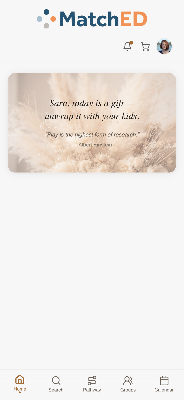
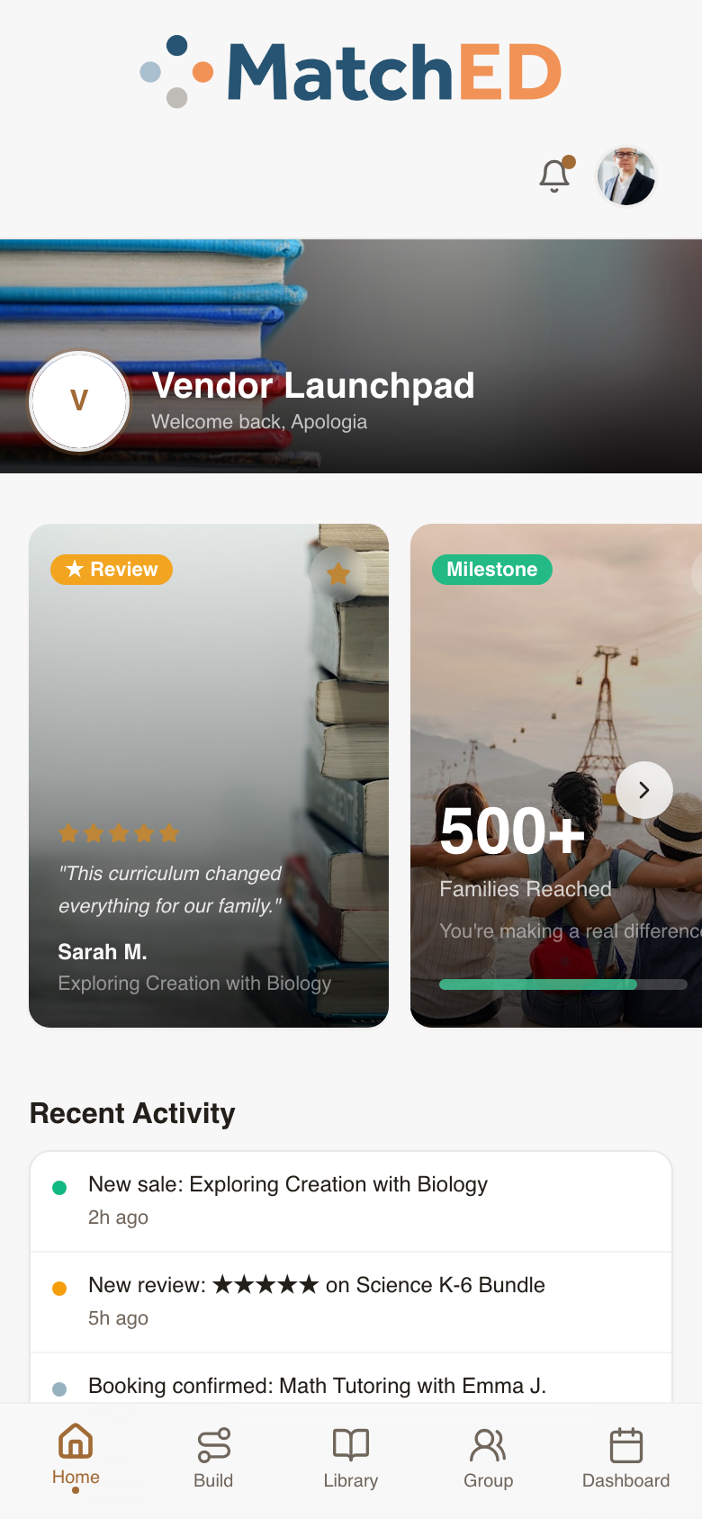
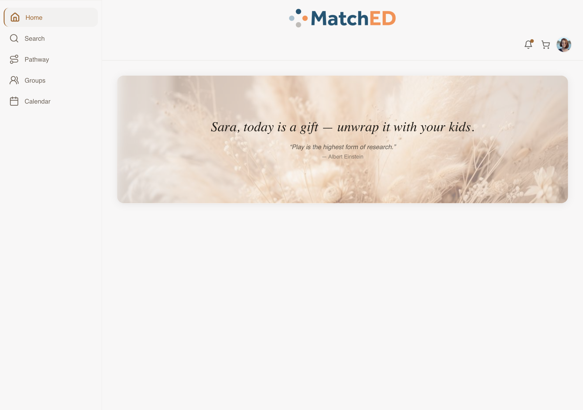
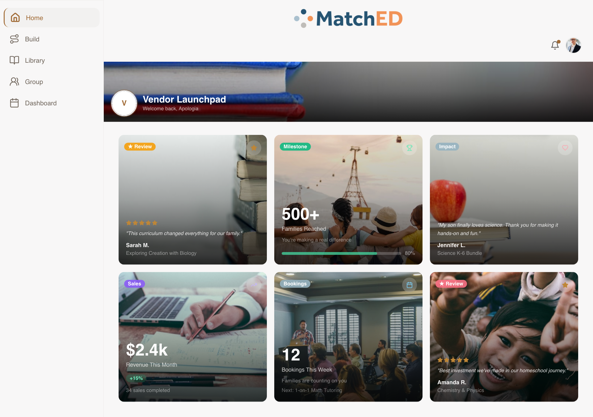
Reactive Layout System — Mobile, iPad & Desktop
Built the structural foundation the entire app runs on. The same screens now adapt intelligently to the device: phone matches Carlee's Lovable designs exactly, desktop shifts to a multi-column sidebar layout. Every surface — Home, Search, Pathway, Groups, Calendar — responds automatically.
What was delivered
- Mobile (390px): 5-tab bottom nav, single-column cards — identical to Lovable prototype
- iPad (820px): two-column cards where it aids scanning
- Desktop (1280px+): sidebar nav, multi-column, no stretched-mobile look
- MatchED visual identity preserved: beige, navy, terracotta, soft photography
Talking point: "This was the skeleton of the whole app. Until this landed, every screen was just a mobile prototype. Now every surface automatically adapts to whatever device your users are on."
📱 Member home — mobile
📱 Vendor home — mobile
🖥 Member home — desktop
localhost:5173/
🖥 Vendor home — desktop
localhost:5173/
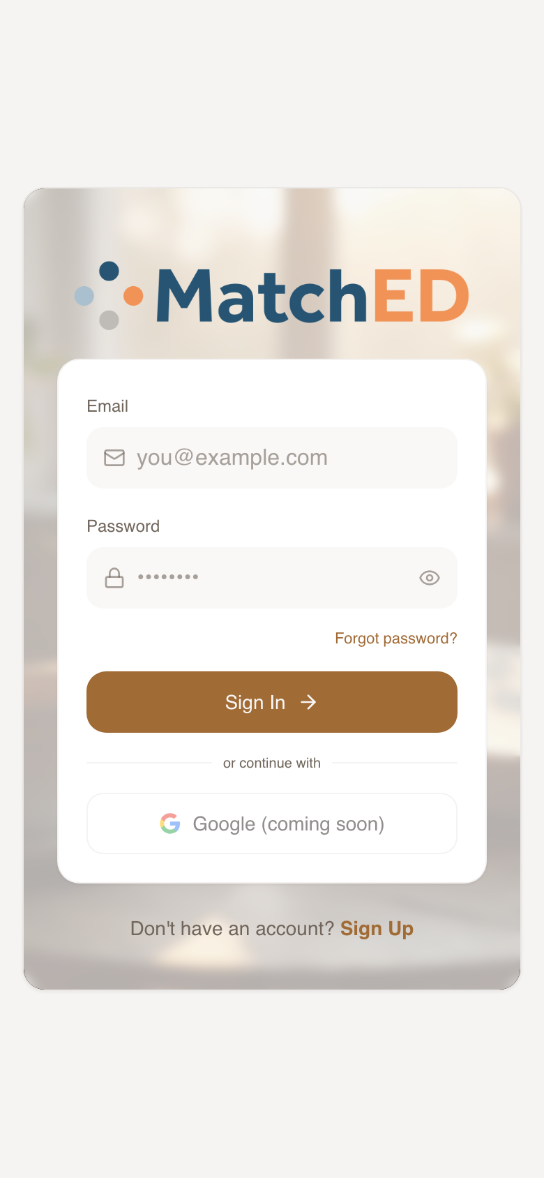
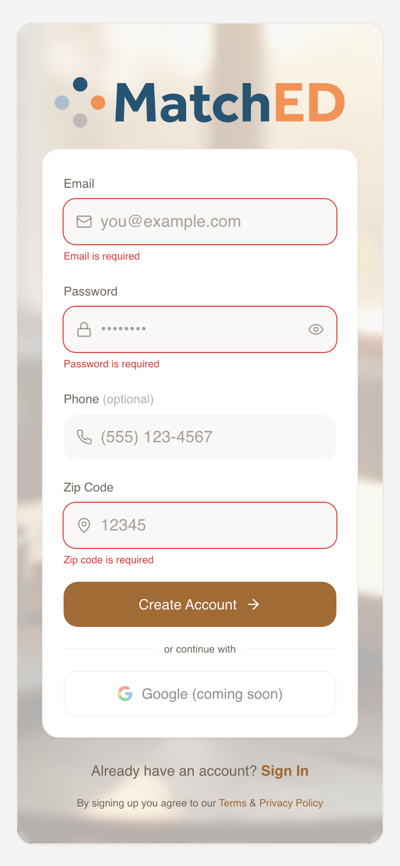
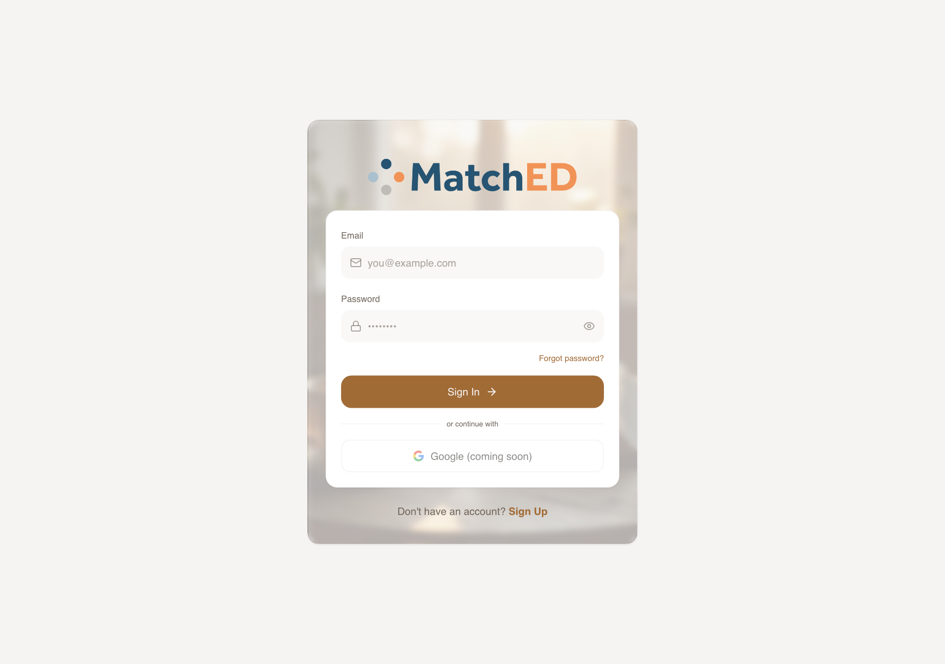
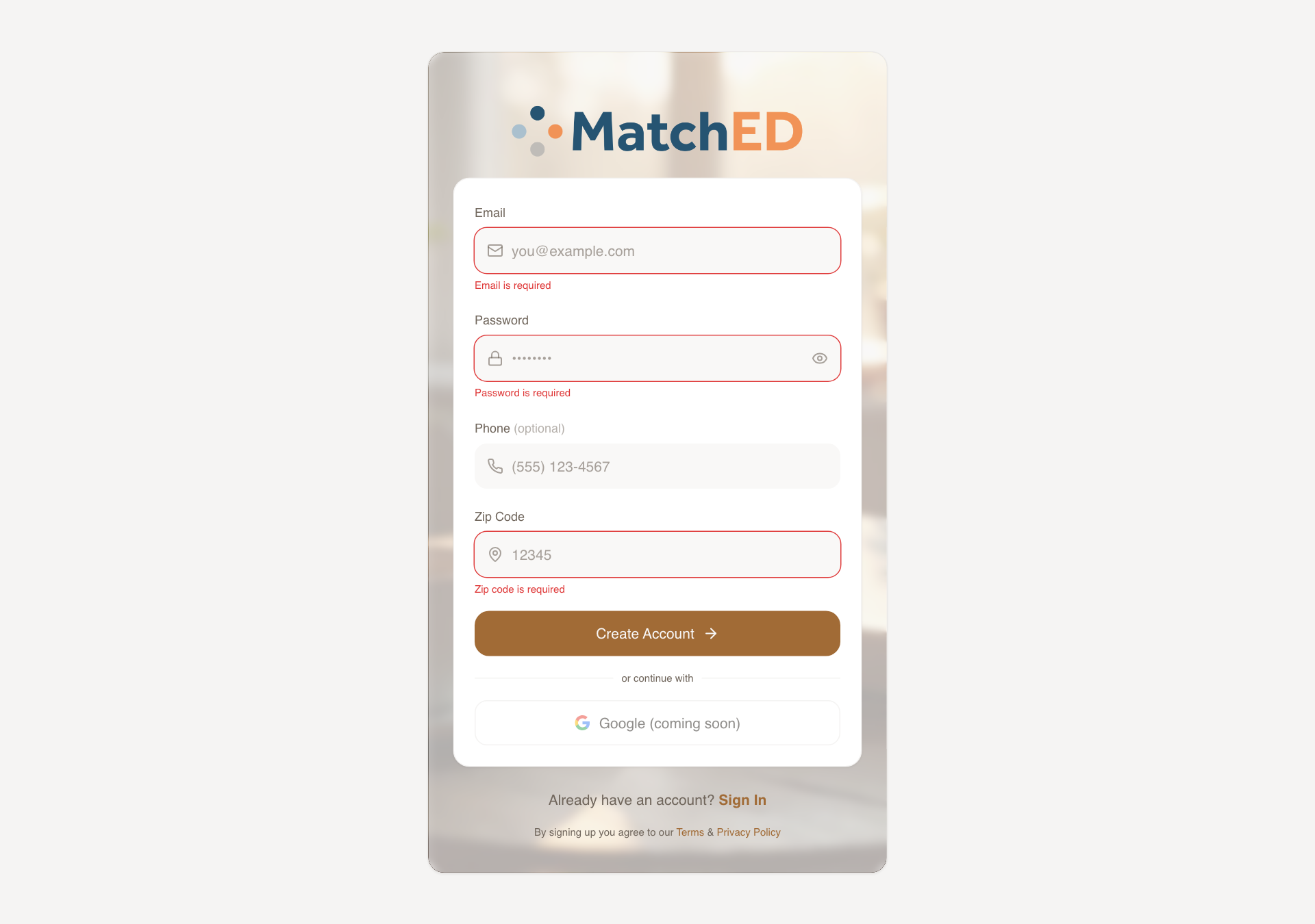
Sign In & Create Account Screens
The first thing a new mom sees. Both screens built to match Carlee's Lovable designs on mobile, with deliberate desktop adaptations. Copy is warm throughout — "Sign in to your MatchED account," errors like "That password doesn't match what we have for you."
What was delivered
- Sign In: email + password, "Forgot password?", full-width terracotta CTA
- Create Account: email, password, optional phone, zip, terms link
- All interaction states: focus, validation error, loading spinner, network error
- Warm beige background, rounded corners, generous padding — on-brand
Talking point: "This is the first impression. Every word was chosen carefully — nothing clinical. It should feel like walking into a welcoming community, not filling out a form."
📱 Sign In
📱 Create Account
🖥 Sign In
localhost:5173/auth
🖥 Create Account
localhost:5173/auth
Home Screen Polish — Filter Button & Chat Bubble Removed
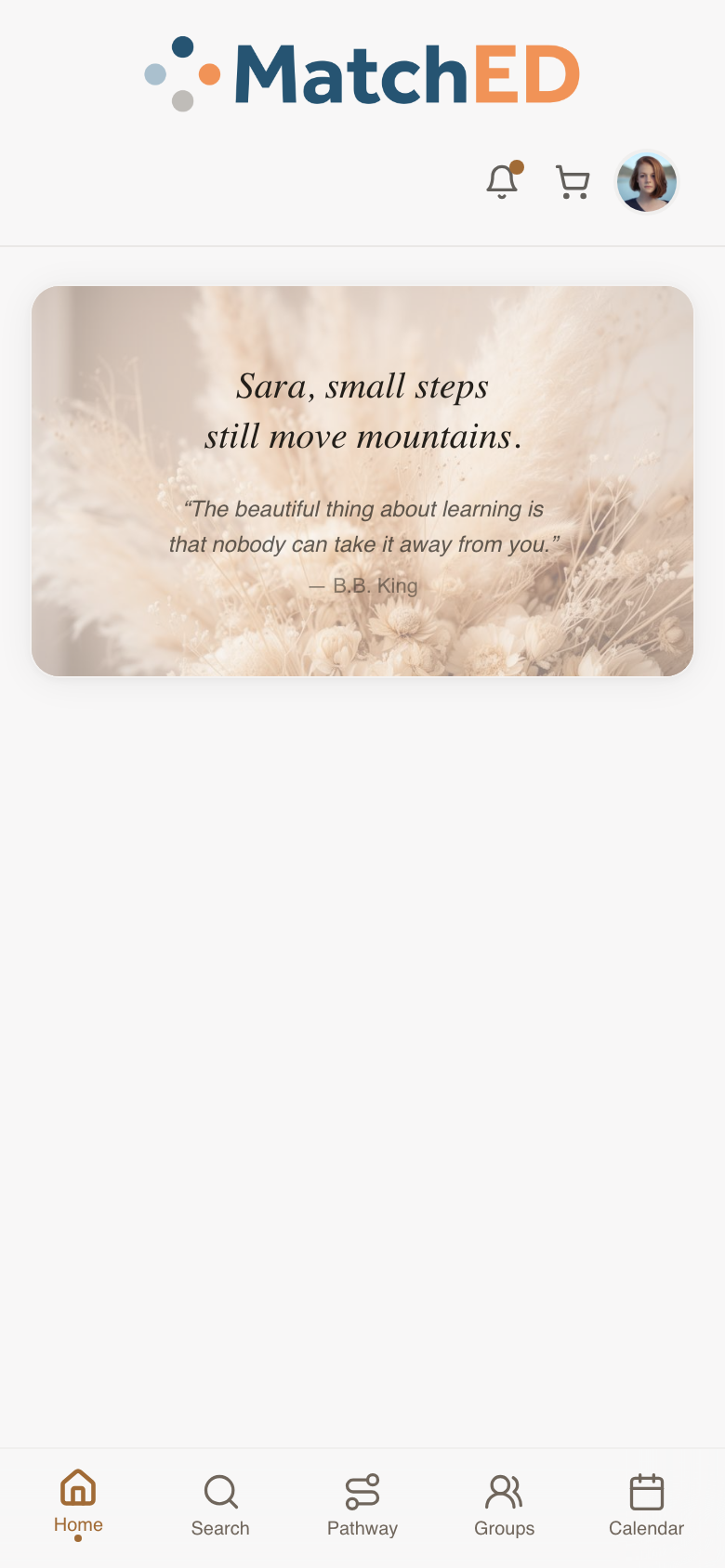
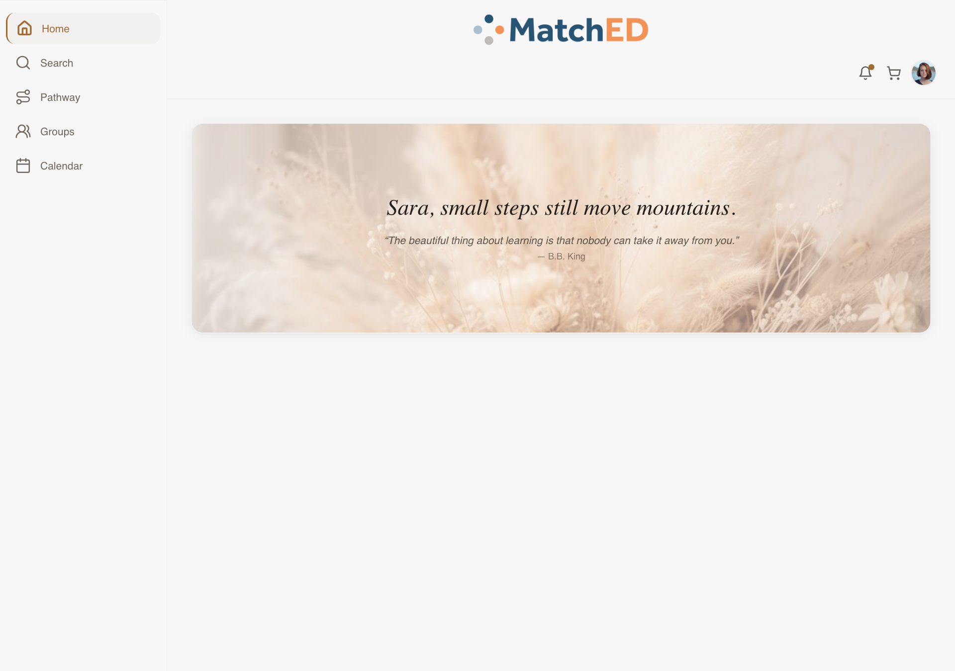
Two targeted clean-ups that make Home feel calmer. The Filter button was removed — the recommender handles curation on Home. The floating chat bubble was removed — it wasn't Carlee's intent and made the screen feel Facebook-like. Chat belongs in Groups.
What was delivered
- Filter button removed — cards reflow naturally, no layout shift
- Floating chat bubble removed — cleaner, less social-media-y
- Verified across mobile, iPad, and desktop breakpoints
- No regressions on Match-of-the-Week scroll or Encouragement card
Talking point: "Small change, big difference. Home should feel curated, not like a marketplace. Removing those two elements brings it much closer to what Carlee intended."
🚫Filter button removed — previously sat above the resource cards; the recommender handles curation automatically now
🚫Floating chat bubble removed — was overlapping cards in the bottom-right corner; chat lives in Groups instead
📱 Mobile — full feed, no filter, no bubble
🖥 Desktop — full feed, no filter, no bubble
localhost:5173/
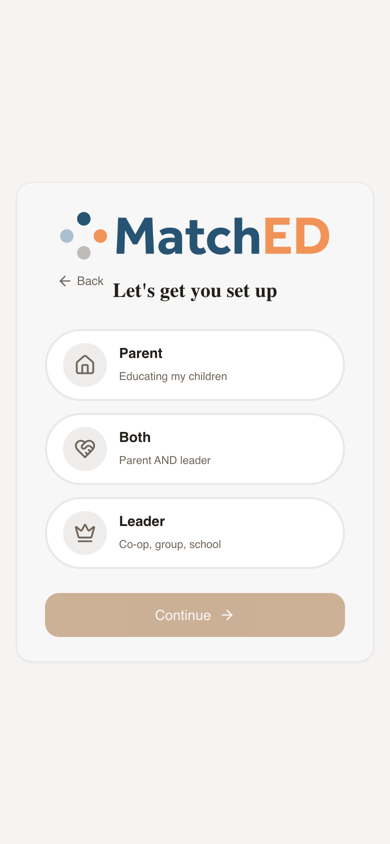
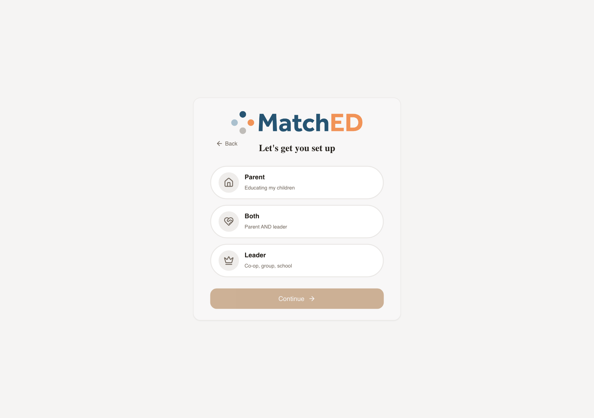
4-Step Onboarding Wizard
A 60-second onboarding after sign-up that collects everything MatchED needs to personalize the app — without ever feeling like a form. Five steps, each a single decision. "Skip for now" on Children means no parent hits a wall.
What was delivered
- Step 0 — Welcome: Member vs. Vendor card-buttons
- Step 1 — Role: Parent / Both / Leader chip selector
- Step 2 — Profile: name, email, zip, optional avatar upload
- Step 3 — Family: schooling type chips (Homeschool, Co-op, Hybrid, Microschool…)
- Step 4 — Children: per-child card with name + grade, "Skip for now" link
Talking point: "This is where MatchED gets to know each family. The personalization — recommendations, trust signals, the Friends filter — all starts here. We designed it to feel like a conversation, not a sign-up form."
📱 Welcome step
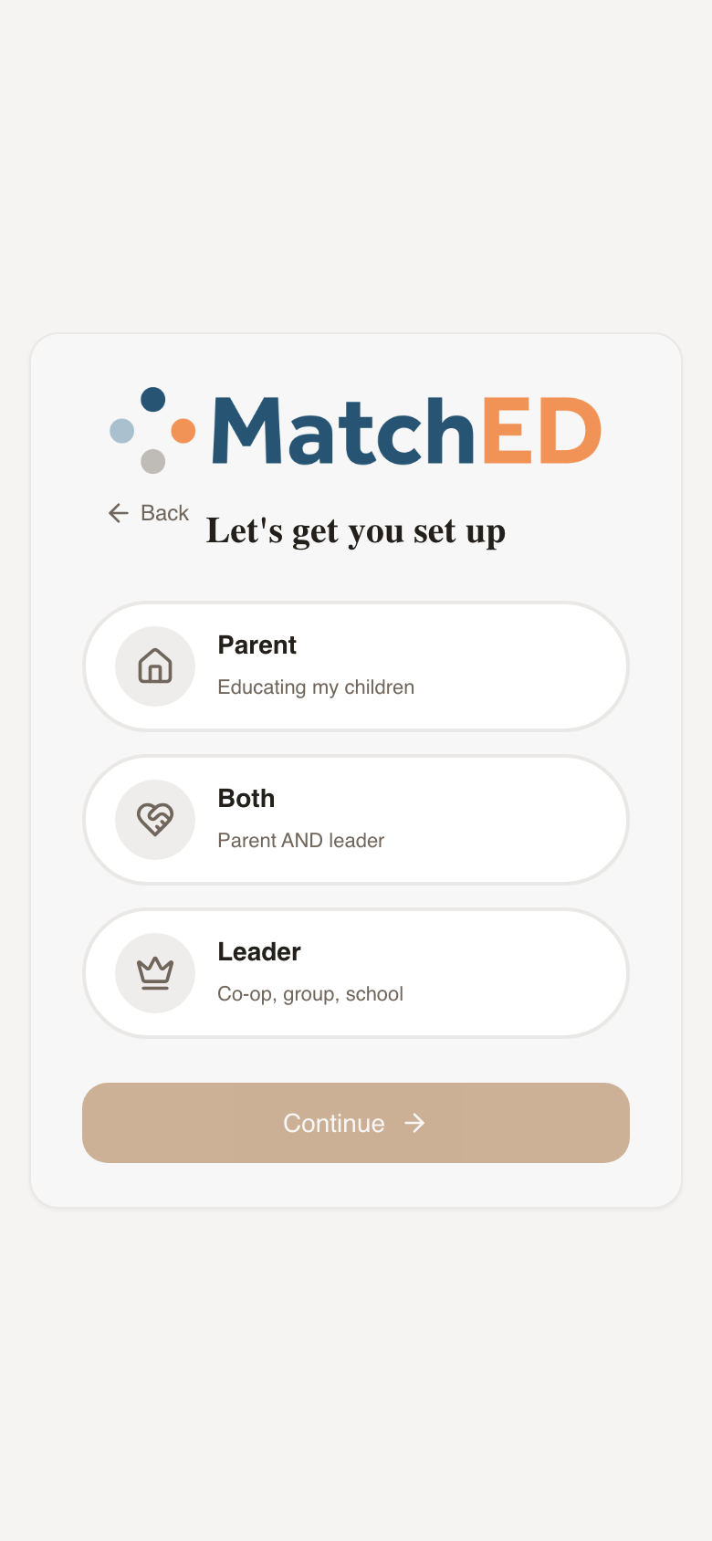
📱 Role step
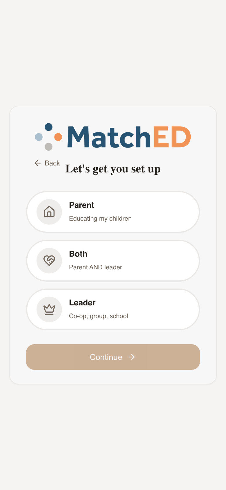
📱 Family step
🖥 Welcome step
localhost:5173/account-setup
Phase 2 — Vendor Experience
Cycle 2 · May 15–29, 2026
7 tasks
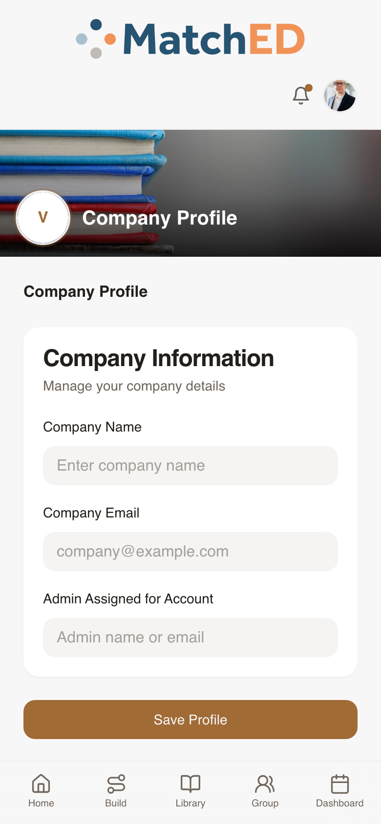
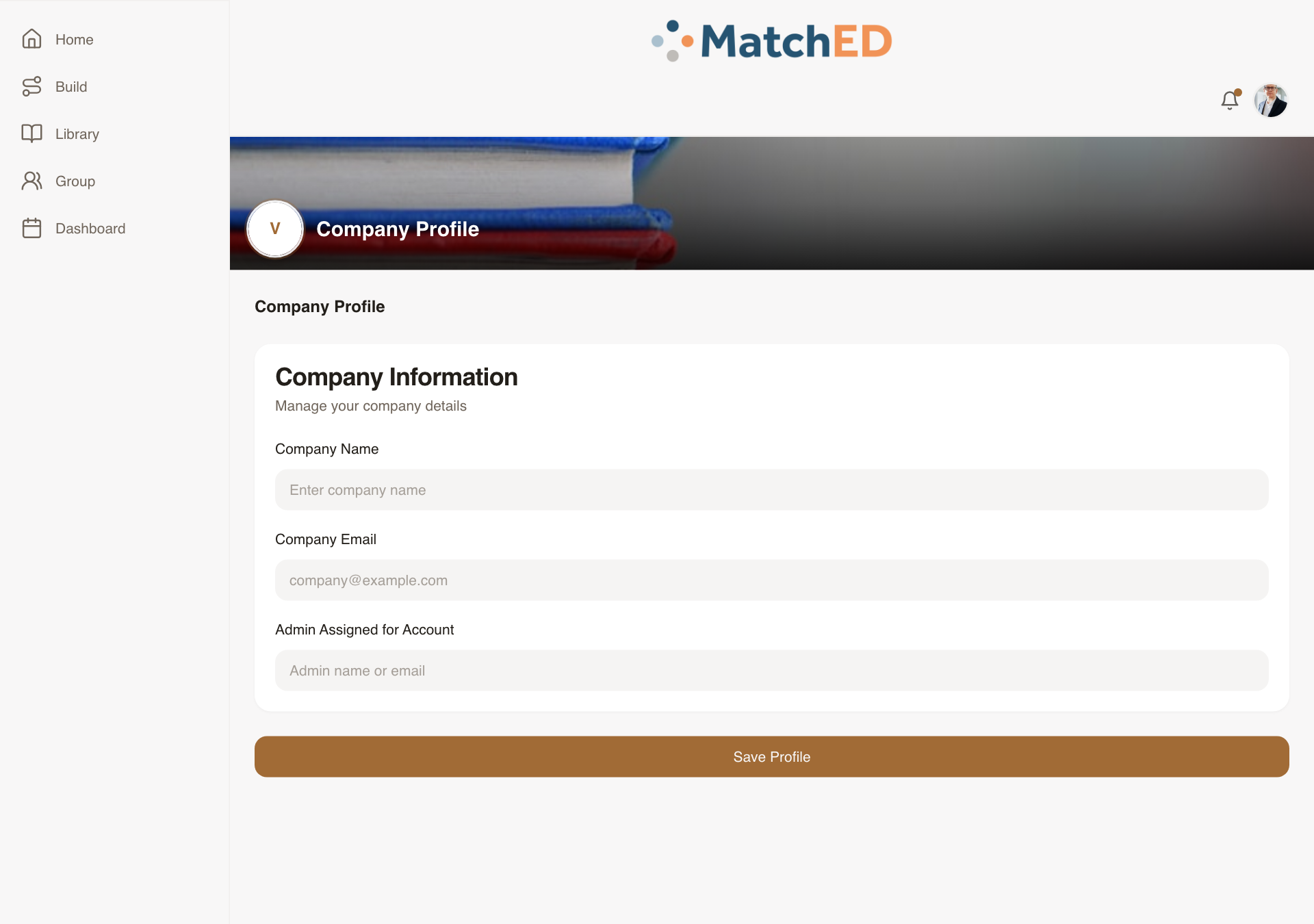
Vendor Signup Flow
The complete end-to-end flow for a curriculum publisher, tutor, or micro-school to join MatchED. From selecting Vendor role through the application form through Company Profile setup post-approval. The Company Profile step was the missing piece — designed and built from scratch.
What was delivered
- Screen 1 — Role selection: Member vs. Vendor toggle
- Screen 2 — Application: Business Name, Email, Phone, Website, Services, Affiliate Agreement
- Screen 2.5 — Submitted modal: "Fill Out Your Vendor Profile" with Let's Go CTA
- Screen 3 — Company Profile (new): logo, tagline, bio, category, location, social links, ESA toggle
Talking point: "Every vendor starts here. We wanted it to feel professional and curated — like applying to something special. The founder approval is real; the UI reflects that honestly."
📱 Role Selection
📱 Company Profile
🖥 Role Selection
localhost:5173/account-setup
🖥 Company Profile
localhost:5173/profile?tab=company
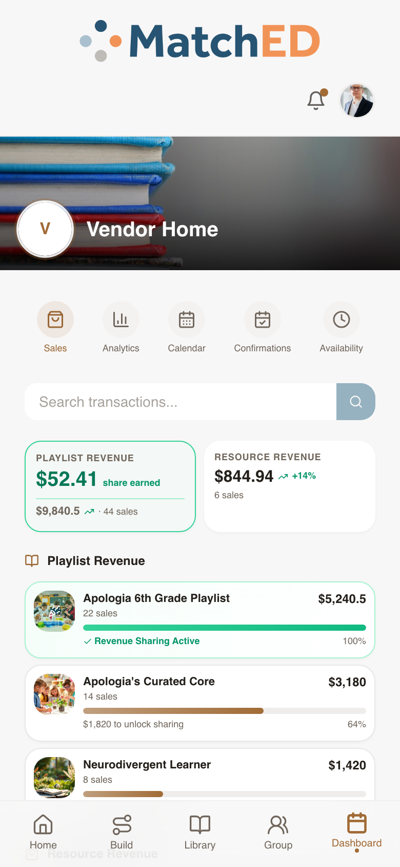
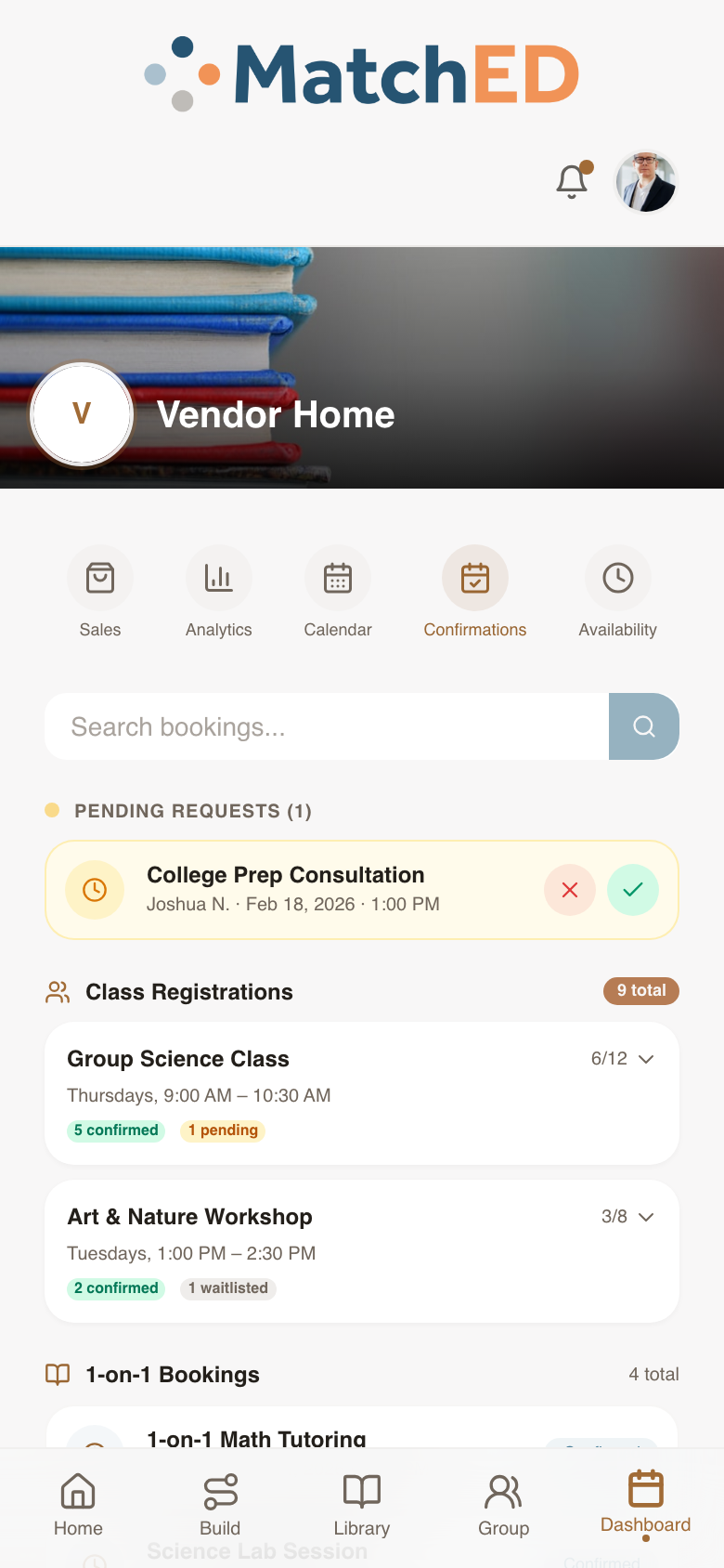
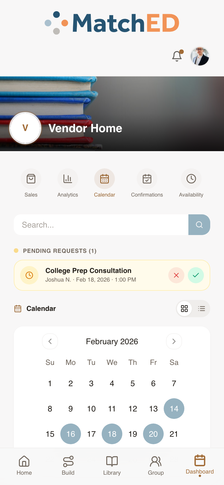
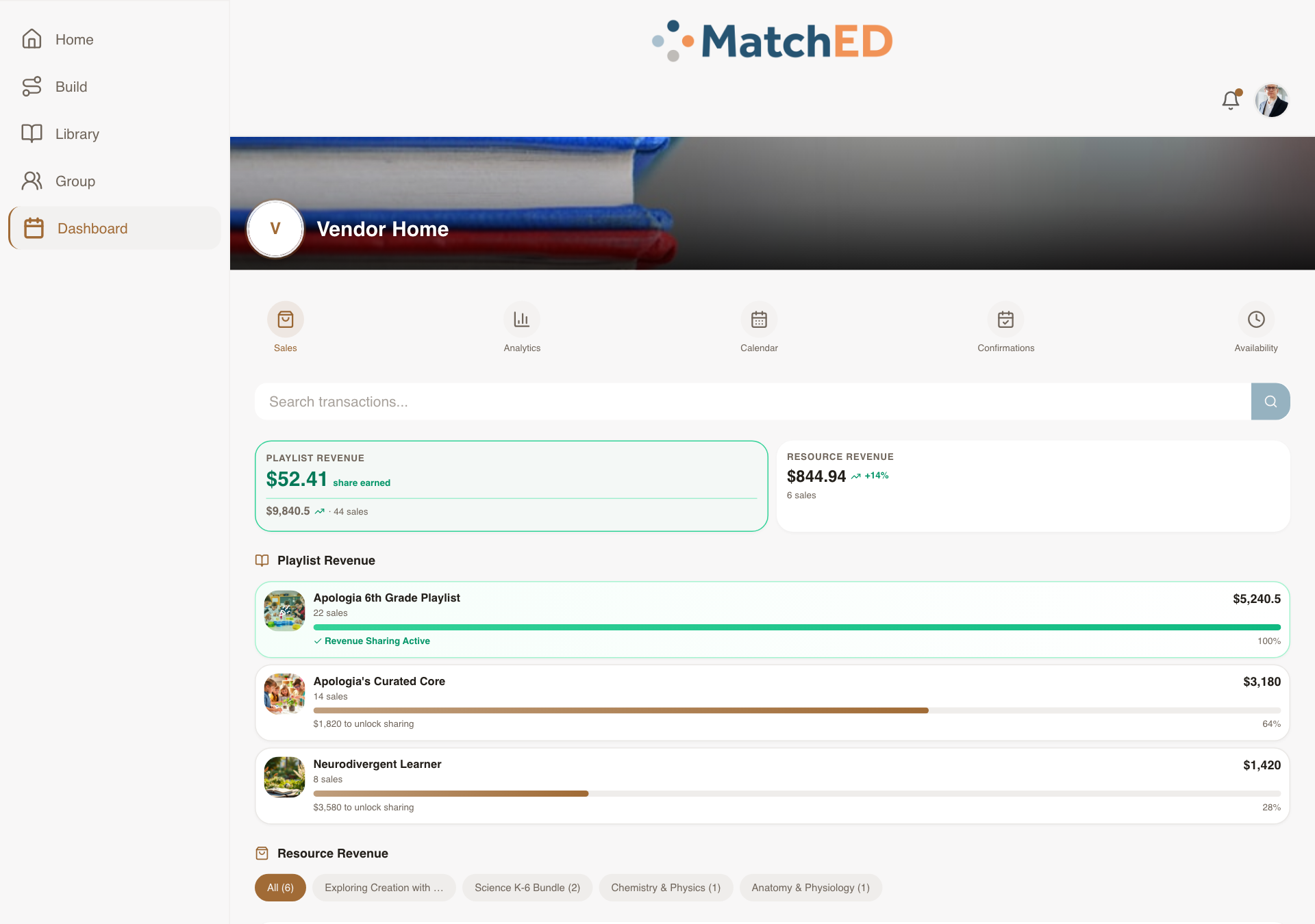
Vendor Dashboard — Sales, Bookings & Calendar
Before building, a structured review with Andrew confirmed exactly what's in scope vs. placeholder. The result: a full dashboard with Sales, Bookings, Calendar, and Availability tabs — each with real mock data that shows what the experience looks and feels like when a vendor has activity.
What was delivered
- Sales tab: transaction list, playlist revenue breakdown, monthly totals
- Bookings tab: upcoming sessions with client, time, price, status, Approve/Decline
- Calendar tab: month view with booked dates highlighted
- Premium Analytics placement — deferred to post-MVP per Andrew review
Talking point: "Rather than building and tearing back features, we confirmed with Andrew what was real vs. placeholder first. That saved a week of rework downstream."
📱 Sales tab
📱 Bookings tab
📱 Calendar tab
🖥 Sales tab
localhost:5173/profile?tab=transactions
Search Results + Recommender Surface
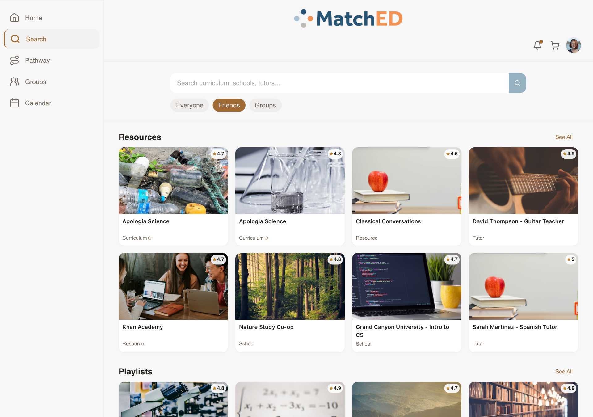
MatchED's core value proposition lives here. Results are ranked by what a parent's trusted network already uses. The Everyone / Friends / Groups filter chips make that trust layer one tap away — calm and intuitive, not crowded like Amazon.
What was delivered
- Everyone / Friends / Groups trust-layer filter chips at top of results
- Resource cards: title, vendor, rating, price, ESA-eligibility badge
- Playlists section alongside Resources — both recommender-ranked
- Tapping "Reviews" auto-scrolls to reviews section
- No "Welcome back" header — personalized greeting belongs on Home only
Talking point: "This is the screen that makes MatchED different. The trust layer — seeing what people in your network already use — is one tap away. No other platform does this."
📱 Everyone results
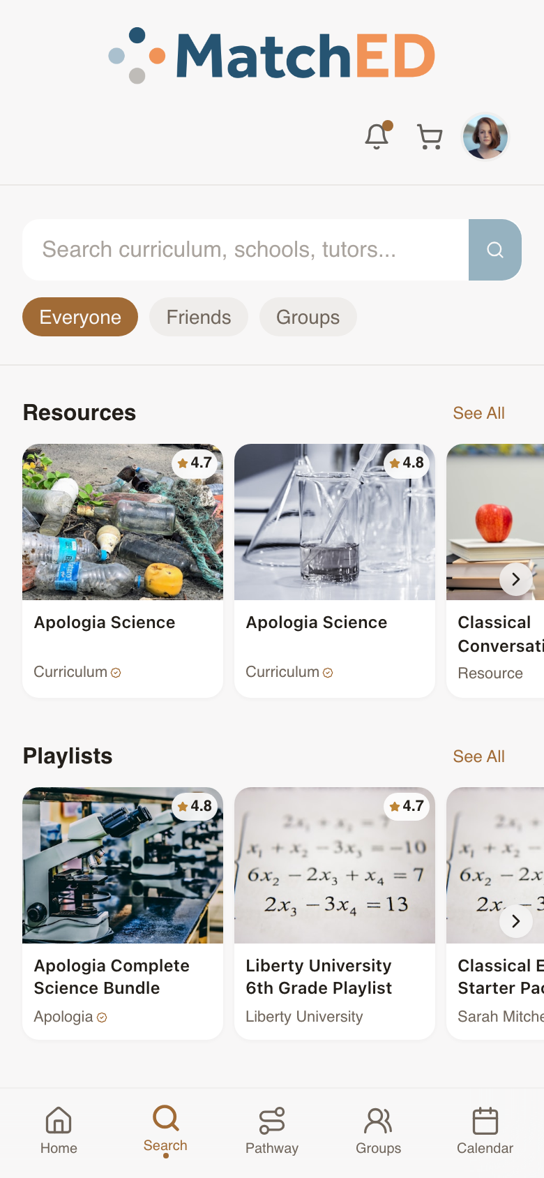
📱 Friends filter active
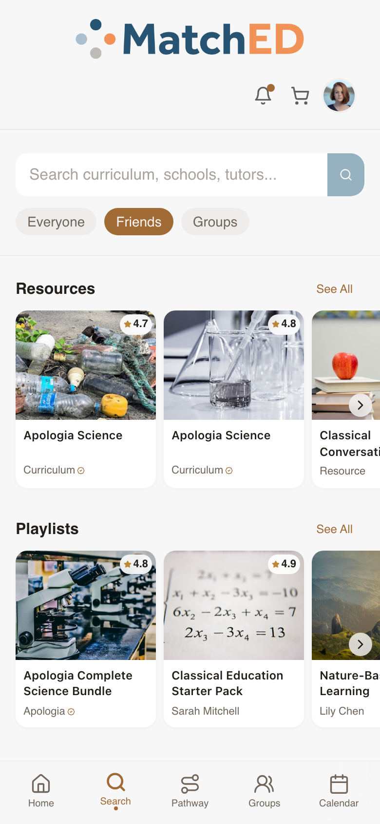
🖥 Everyone results
localhost:5173/search
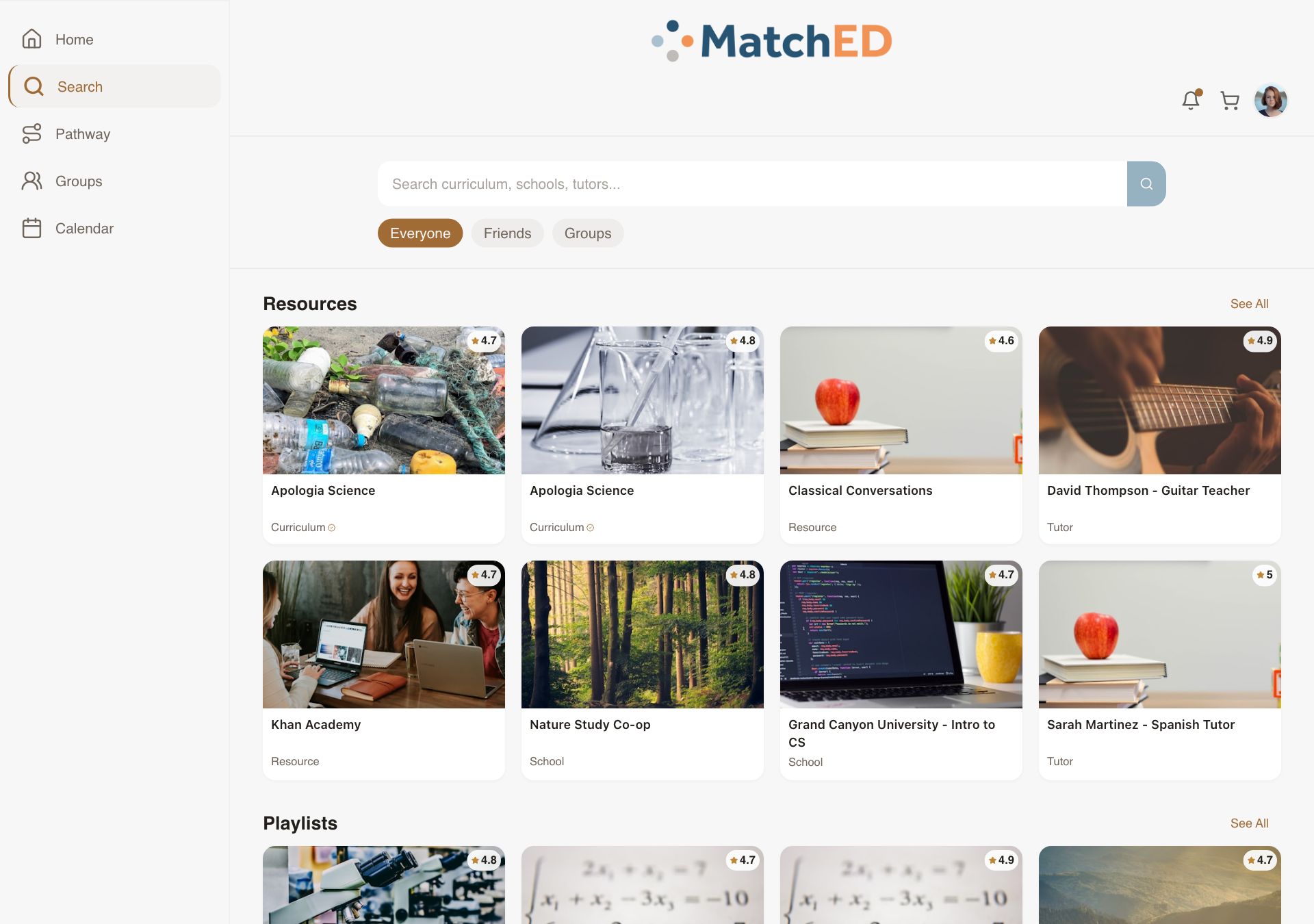
🖥 Friends filter active
localhost:5173/search
Payment Success & Failed States (Stripe Checkout)
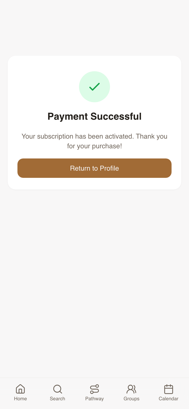
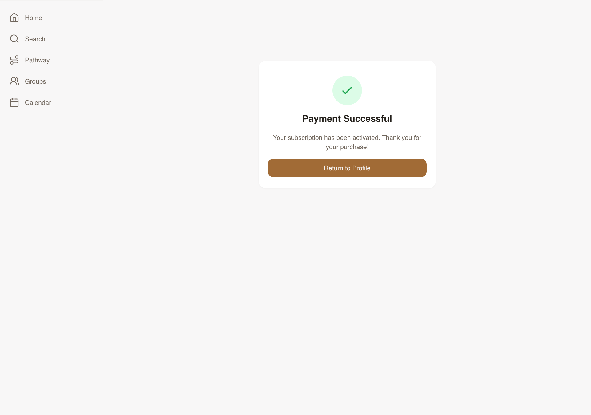
Two return-state screens after Stripe checkout — reassuring on success, helpful on failure. Completely undesigned before this task. These unblocked Daniel's Stripe wiring on the critical launch path.
What was delivered
- Success screen: green check, "Payment Successful," subscription activated message, Return CTA
- Failed screen: clear "Payment didn't go through," Stripe error reason, cart-preserved confirmation, Retry CTA
- Cart cleared on success, preserved on failure
- Consistent with Carlee's brand, responsive across all breakpoints
Talking point: "The moment after payment is when users are most invested. Getting this wrong destroys trust. We made success feel like a celebration and failure feel like a helpful next step."
📱 Payment success — mobile
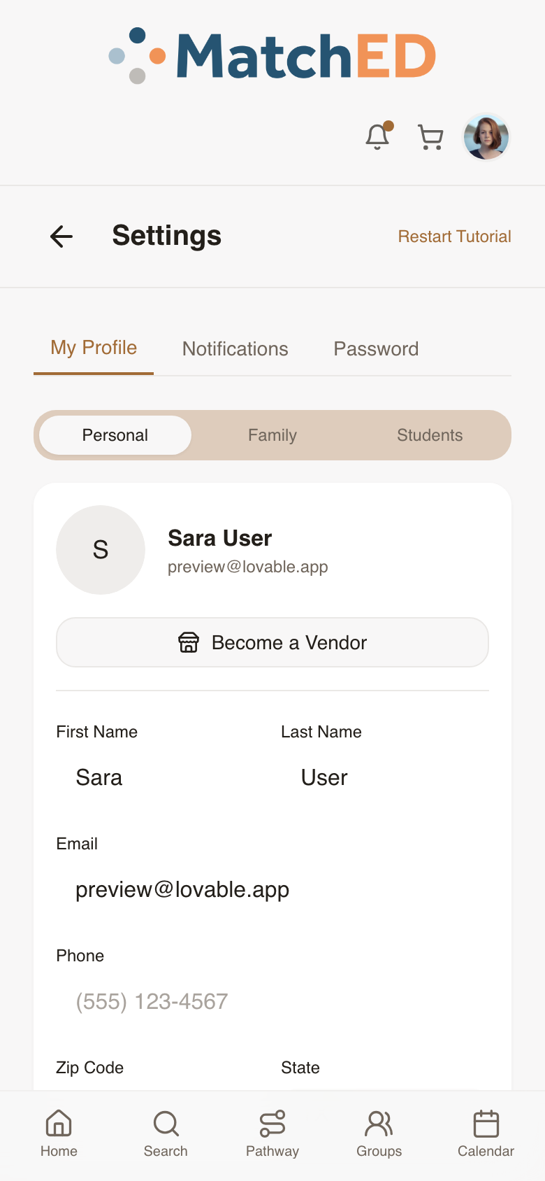
📱 Member bookings — post-payment
🖥 Payment success — desktop
localhost:5173/payment-success
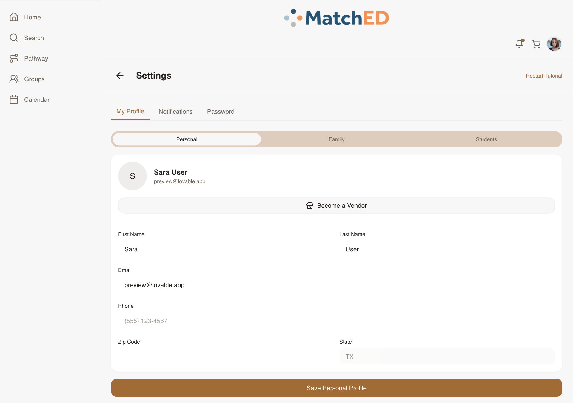
🖥 Member bookings — desktop
localhost:5173/profile
Vendor Library — Catalog Management View
Vendors with growing catalogs need one place to find, manage, and update their content. This is the vendor's own back-office catalog view — visually distinct from the member Library, with affordances to edit, archive, or preview any resource as a member would see it.
What was delivered
- Card/list view: title, thumbnail, price, status (published/archived), views, rating
- Per-resource: View Detail, Edit (opens Resource Builder), Archive, View as Member
- Filter by Published / Archived; Sort by: recently created / sales / rating
- First-day empty state: "Create your first resource" CTA
Talking point: "As vendors publish more resources, managing them becomes a real problem. This gives every vendor a fast way to find, update, and preview everything they've published."
📱 Vendor Library — mobile
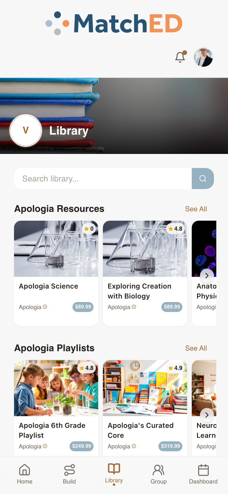
📱 Vendor Company Profile — mobile
🖥 Vendor Library — desktop
localhost:5173/profile?tab=library
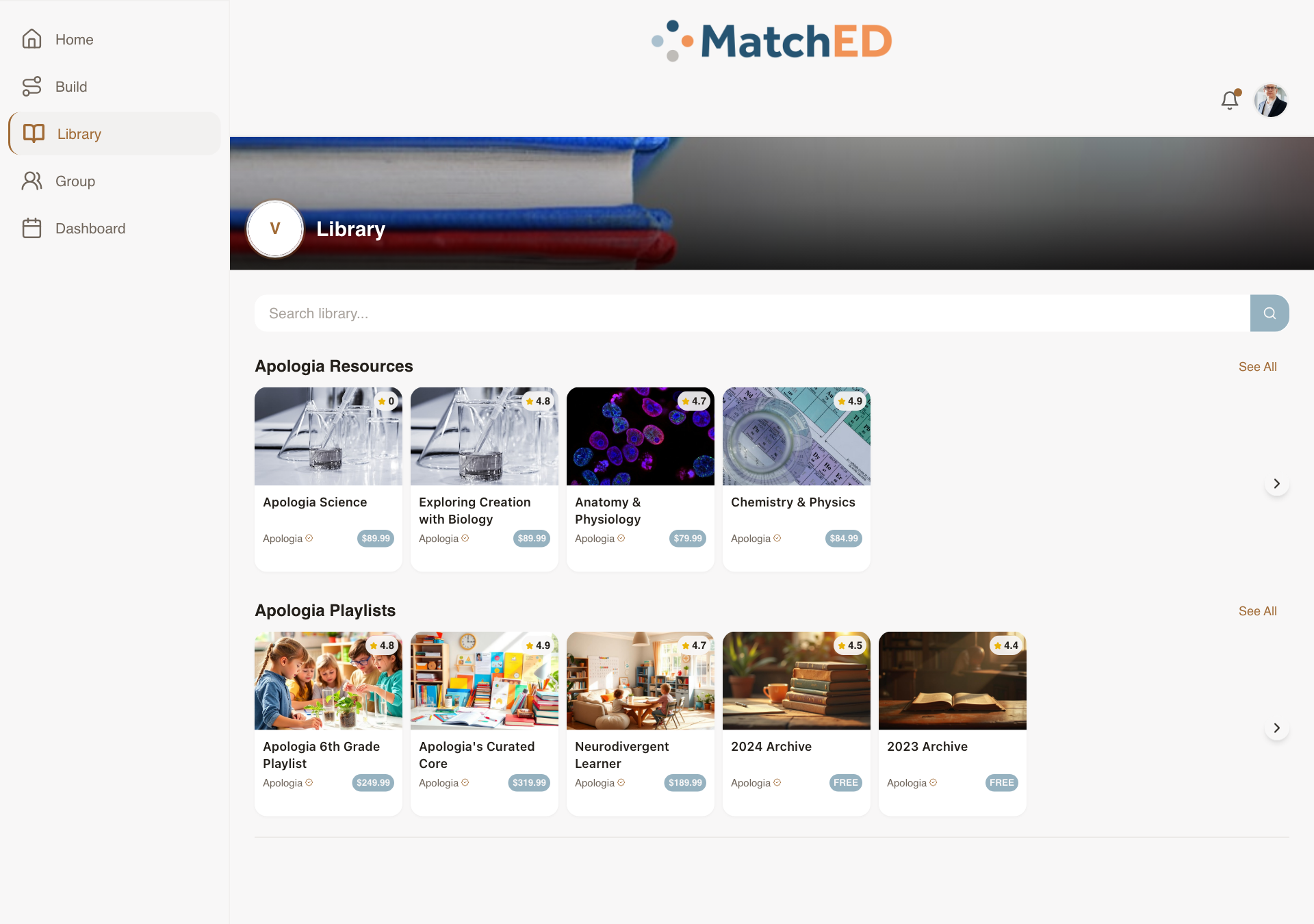
🖥 Vendor Company Profile — desktop
localhost:5173/profile?tab=company
Resource Builder — Vendor-Side Form Fields
The form a vendor fills when publishing a new resource. The two highest-leverage fields — "Searchable By" and the "Purchase vs. Register" toggle — both received clear UI treatment so vendors never have to guess what they're choosing.
What was delivered
- Basic fields: Title, Type, Description, Cover Image, Pricing, ESA eligibility by state, Tags
- Searchable By toggle: My Group / All MatchED — with inline explainer
- External Purchase Link field — bypasses cart, routes externally
- Action toggle: Purchase (cart) vs. Register (booking flow) — with tooltip + save confirmation
- Public Funding Eligible toggle — shows ESA badge in Search when on
Talking point: "The Resource Builder is where the MatchED catalog grows. We need vendors to get it right on first save — a bad listing hurts the whole marketplace. Every field on this form earns its place."
📱 Build tab — choose type
📱 Resource form — all fields
🖥 Build tab — desktop
localhost:5173/profile?tab=build
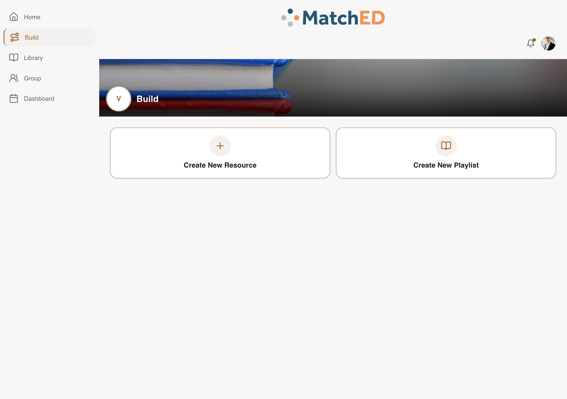
🖥 Resource form — desktop
localhost:5173/profile?tab=build
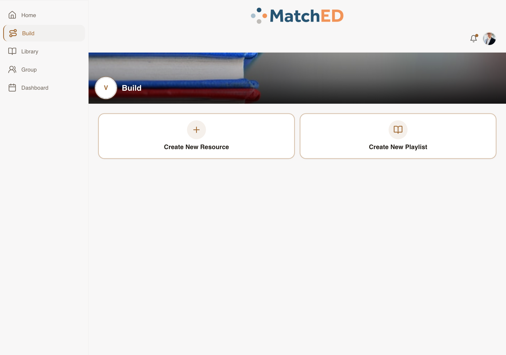
Vendor Home / Launchpad — Metric Tiles
What a vendor sees the moment they open MatchED. Not a blank dashboard — a personalized at-a-glance view of how their business is performing. A vendor who immediately sees "500+ Families Trusted" and "$2.4k this month" knows MatchED is worth their attention.
What was delivered
- Personalized greeting with vendor name
- Metric tiles: Latest 5-star review, Families Trusted, Sales This Month, Bookings This Week, Milestone
- Quick Actions: Create Resource, Confirmations (only when pending exist)
- Encouraging first-day empty state — not blank, not intimidating
Talking point: "We designed this to answer one question in under 5 seconds: 'Is MatchED working for my business?' Vendors who can answer yes come back. Vendors who have to dig through tabs to find it don't."
📱 Vendor Launchpad — metric tiles
📱 Vendor Sales Dashboard
🖥 Vendor Launchpad — desktop
localhost:5173/
🖥 Vendor Sales Dashboard — desktop
localhost:5173/profile?tab=transactions
Phase 3 — Member Experience
Cycle 3 · May 27 – June 2, 2026
4 tasks
Per-Resource Visibility Selector
The privacy control that makes MatchED's trust layer real. Without this, the Friends / Groups filter in Search has nothing to filter on. An inline three-option selector appears at the moment of saving — sensible default (Groups + Friends), shown on every resource card so parents always know their setting.
What was delivered
- Inline selector at save/create moment: Private / Groups + Friends / All MatchED
- Default: Groups + Friends (the trust-layer sweet spot)
- Visibility icon shown on every resource card — tap to change inline
- Public→private shows a confirmation step
- Backend Search index respects per-resource visibility
Talking point: "This is the mechanism that makes the trust layer work. The Friends / Groups filter in Search is only meaningful if parents have set visibility on what they've saved. This gives them that control — simply, inline."
📱 Save to Library sheet
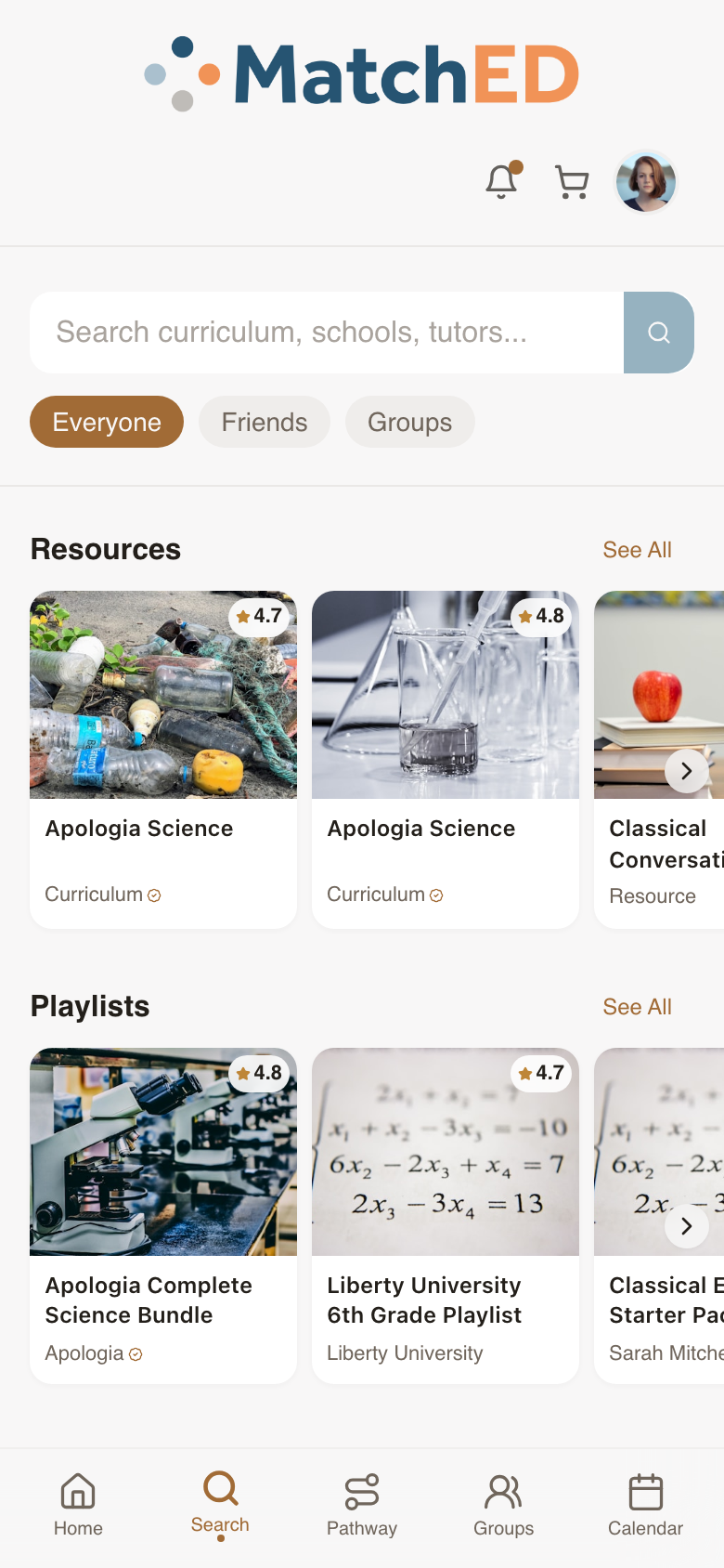
📱 Search — resource cards
🖥 Save to Library sheet
localhost:5173/search
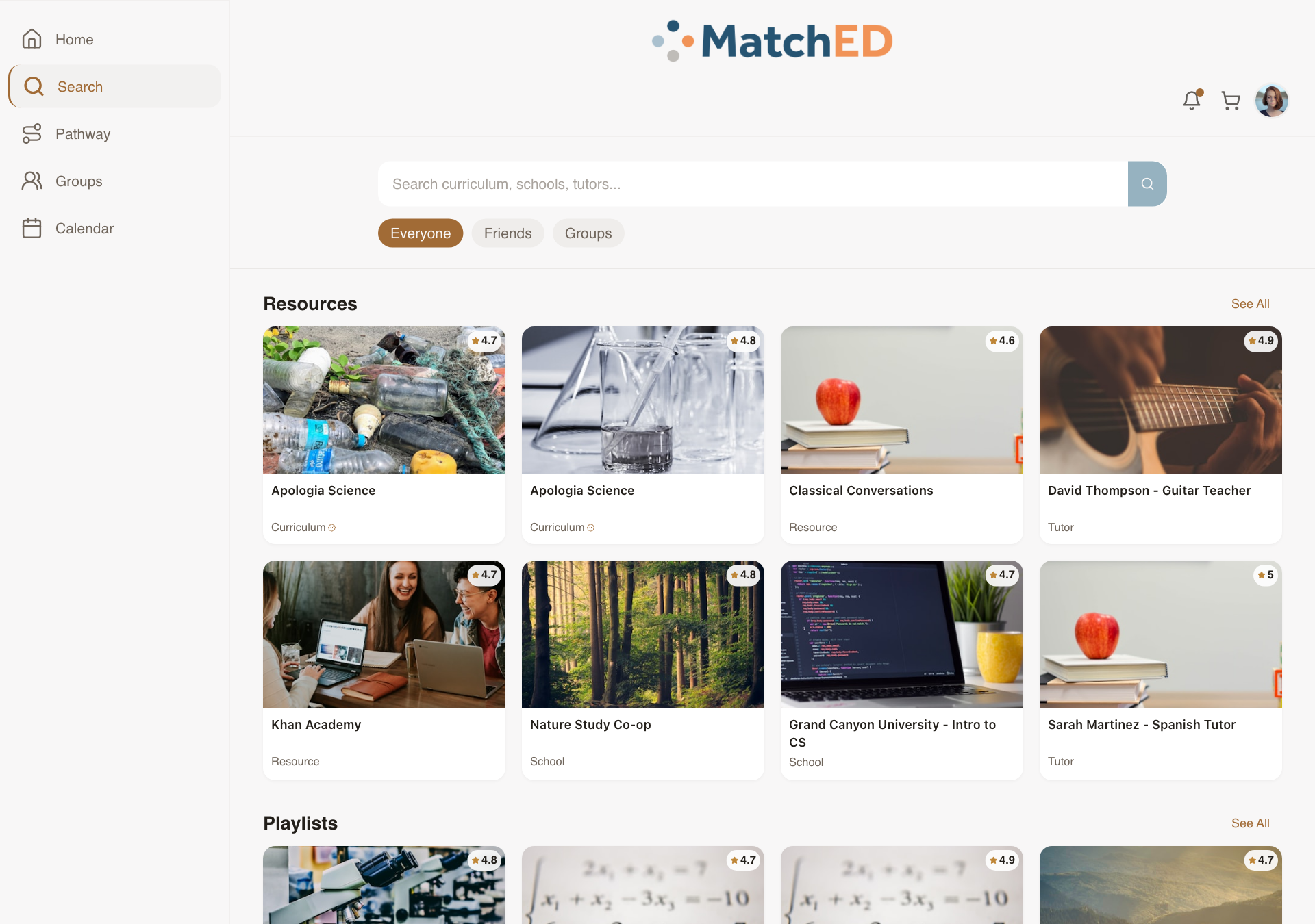
🖥 Search — resource cards
localhost:5173/search
Public Profile / Portfolio View
When a parent taps another member's name anywhere in the app, she sees enough to decide whether to trust or connect — not a social media page, a homeschool community snapshot. Privacy is respected strictly: only info the parent has opted to share is ever shown.
What was delivered
- Header: photo, name, city (not full address), member-since date
- Family info (opt-in only): schooling type, number of children, grade ranges
- Shared signals: shared groups (clickable), mutual friends count
- Public playlists: only those set to All MatchED visibility
- Send Friend Request CTA with pending/accepted status
Talking point: "The trust layer only works if people are knowable to each other. This gives every parent a clean, privacy-respecting way to introduce herself — on her own terms."
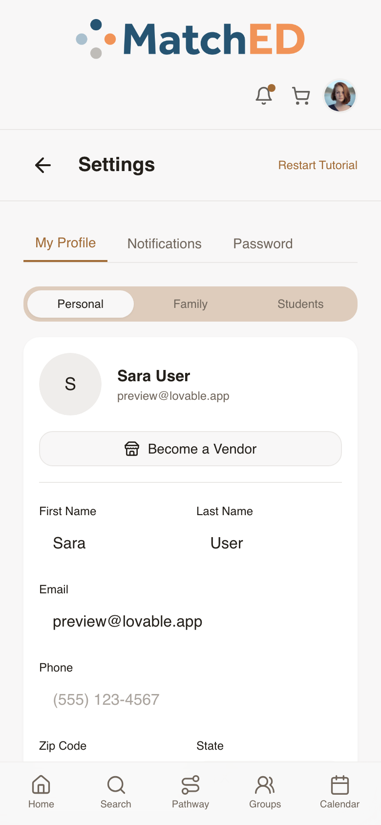
📱 Public profile view
📱 Own profile
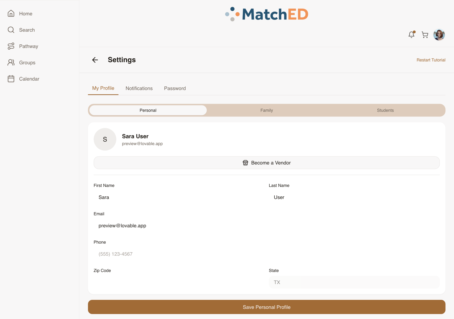
🖥 Public profile view
localhost:5173/user/mock-other-user
🖥 Own profile
localhost:5173/profile
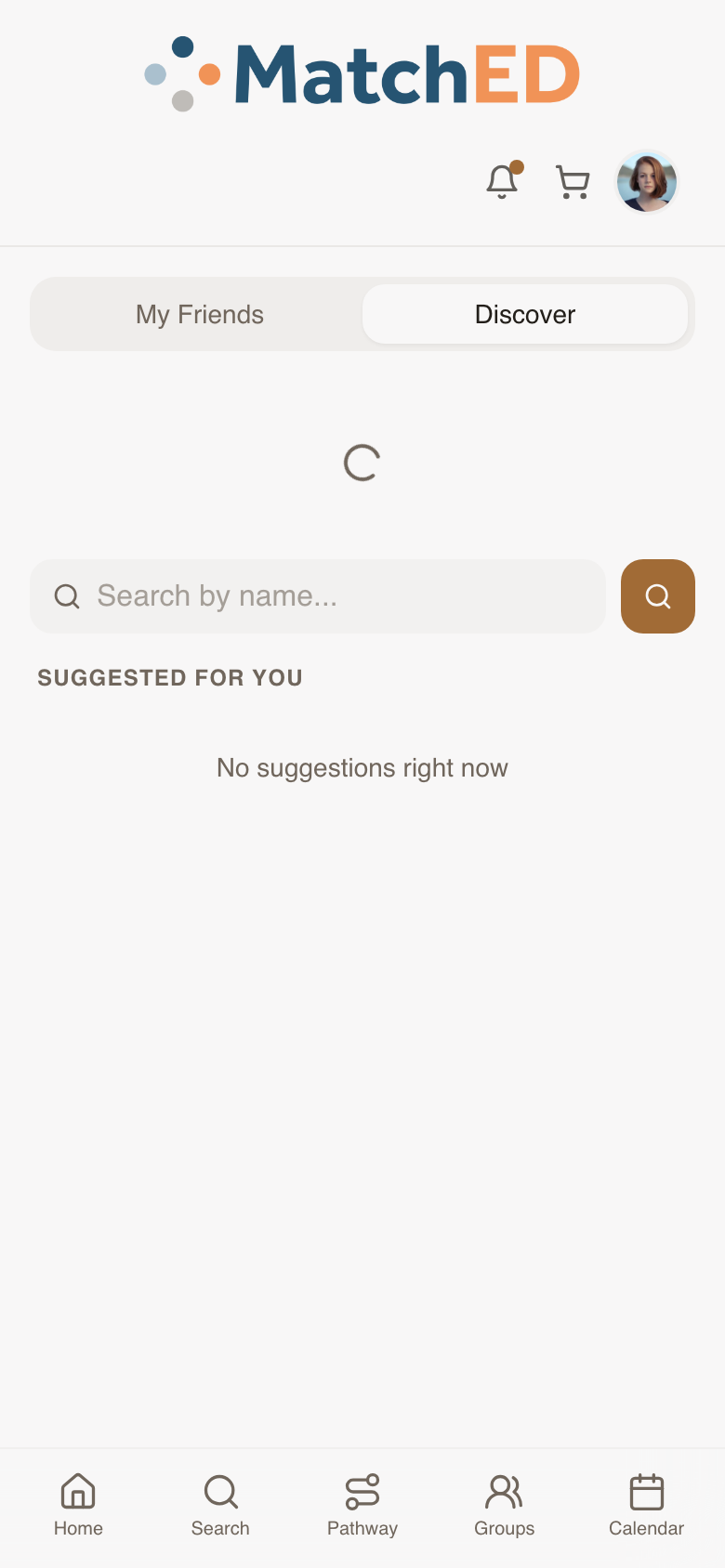
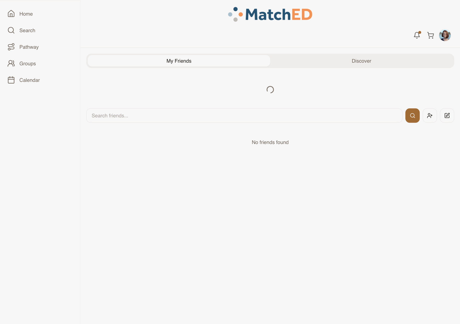
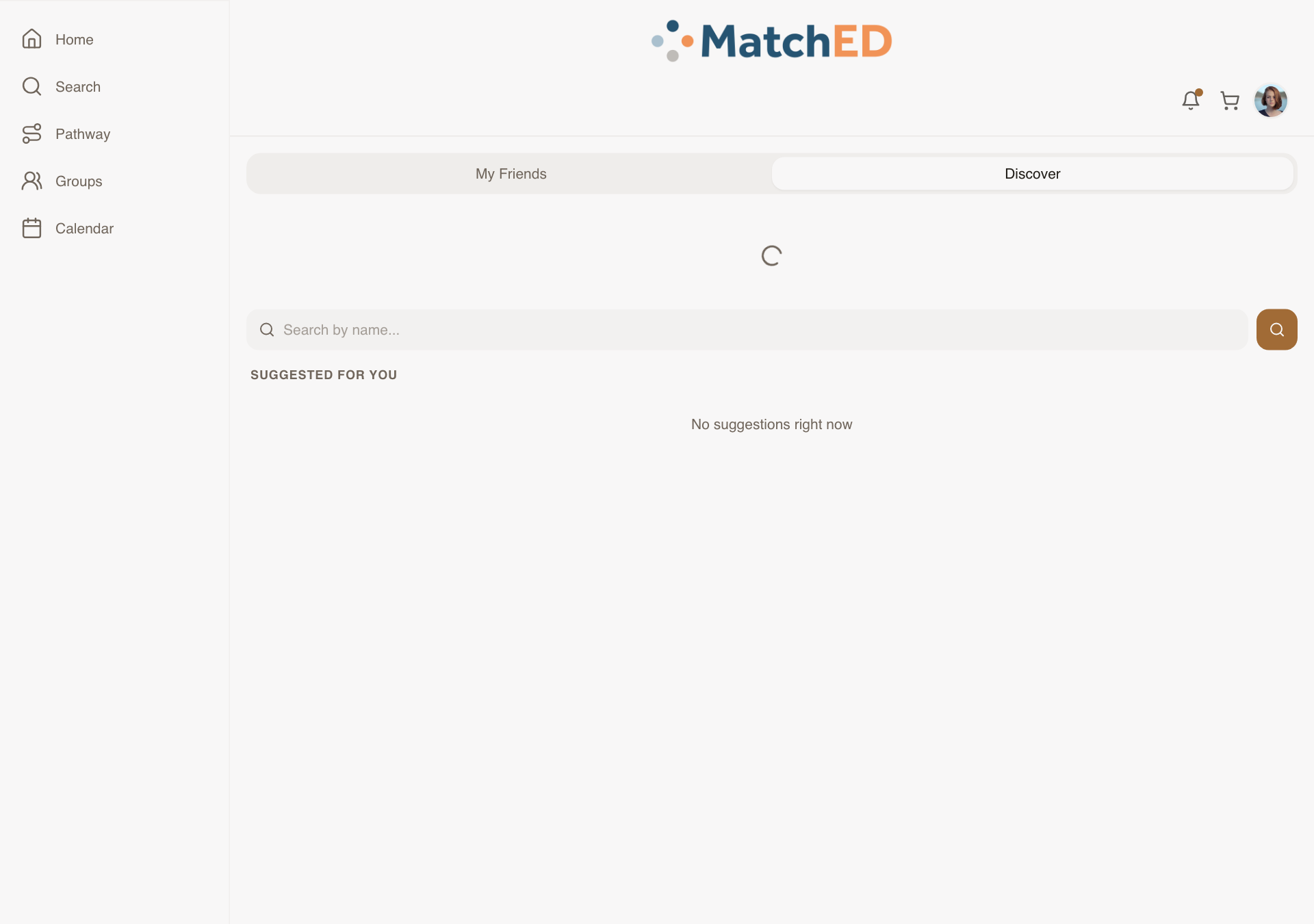
Friends Discover Tab
MatchED's network effect depends on parents having friends. Without a way to find people, new parents are stuck — they can't use the Friends filter in Search because they have no friends yet. Discover surfaces ranked suggestions based on signals the parent already trusts: shared groups, mutual friends, similar family.
What was delivered
- Discover tab added inside Friends (alongside My Friends, Pending, Add by name)
- Suggestion cards: photo, name, city, shared signal ("in your Wild Hearts Co-op")
- Ranking: same group, mutual friends, schooling type, grade levels
- Send Request per card; Pass/Skip so dismissed suggestions don't reappear
- Empty state: join a group or invite by email CTA
Talking point: "Discover closes the cold-start problem. A new parent who joins a group immediately gets suggestions from people in that group. The network starts working from day one."
📱 My Friends tab
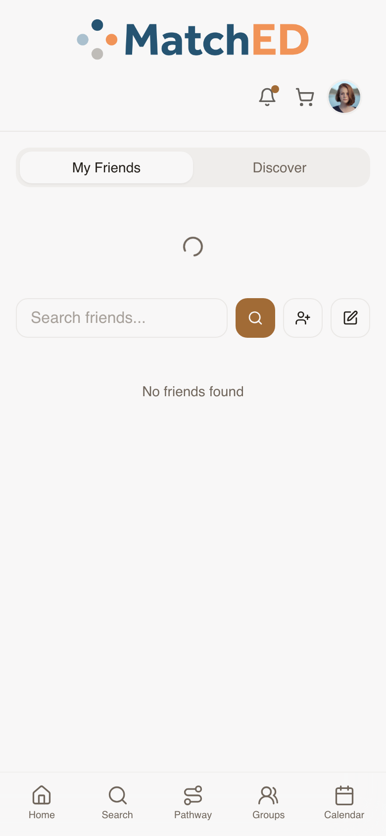
📱 Discover tab
🖥 My Friends tab
localhost:5173/friends
🖥 Discover tab
localhost:5173/friends
Member-Facing Booking Detail Surface
The last piece in the booking loop. Vendors can now host sessions and classes — parents who book need somewhere to go to see what they signed up for, when, and how to prepare. My Bookings list plus a per-booking detail page that answers every question before the session starts.
What was delivered
- My Bookings list: Upcoming (nearest first) + Past bookings (collapsed)
- Per-booking detail: vendor, session, date/time, capacity, price paid, location/link, prep notes
- Add to Calendar CTA (iCal / Google Calendar)
- Cancel Booking CTA (subject to vendor policy)
- No-bookings empty state with Search CTA
Talking point: "The booking experience was complete on the vendor side but invisible to members. A parent who booked a tutoring session had nowhere to go to find when it was. This closes that loop entirely."
📱 Vendor: Bookings tab
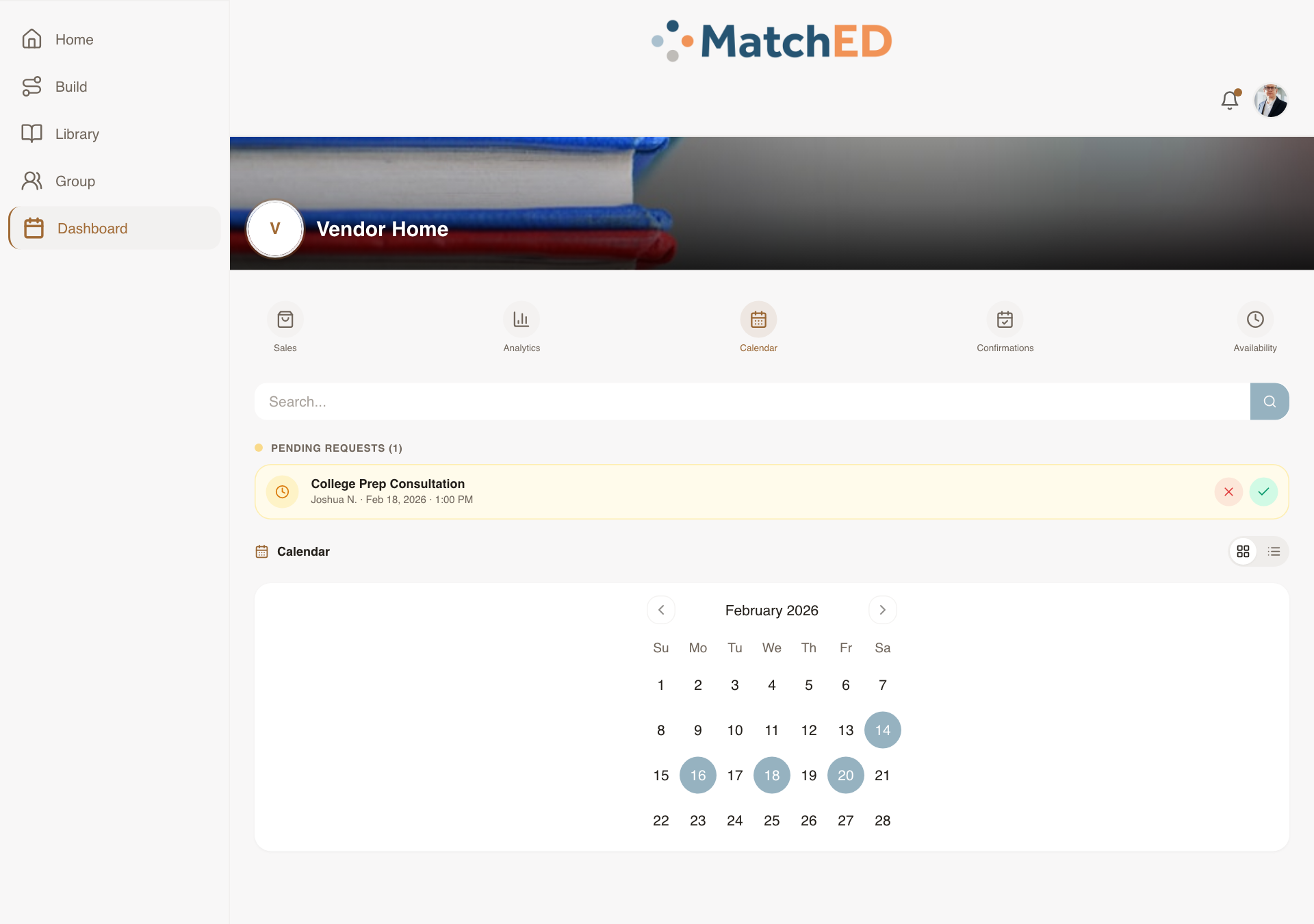
📱 Vendor: Calendar tab
🖥 Vendor: Bookings tab
localhost:5173/profile?tab=transactions&dashTab=bookings
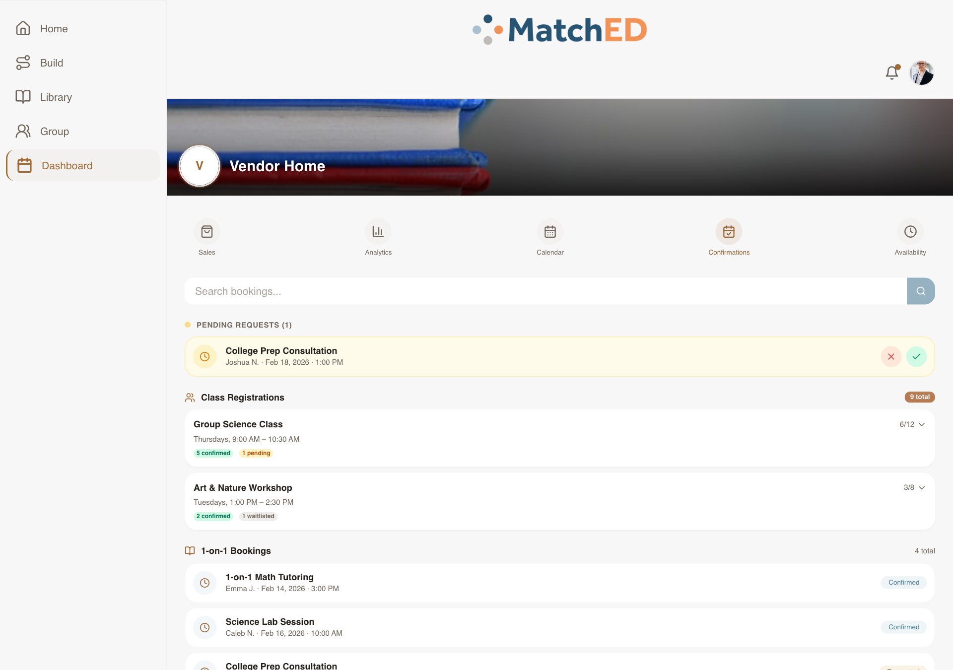
🖥 Vendor: Calendar tab
localhost:5173/profile?tab=transactions&dashTab=calendar
Phase 4 — Latest Sprint
Cycle 4 · June 3–8, 2026
5 tasks
Vendor Public Profile — Member-Facing Credibility Surface
When a member taps a vendor's name in Search, on a resource detail, or in a review, they now land on a clean profile that tells them who this vendor is and whether to trust them. Not a marketing page — a credibility surface that answers "is this the right vendor for my family?"
What was delivered
- Vendor name, avatar, location, and school type displayed at a glance
- Published resources listed — tap any to go directly to the resource
- Reviews and trust signals visible without scrolling
- Connect and Message CTAs — members can reach out from the profile
- Responsive across mobile, iPad, and desktop
Talking point: "Before this, a parent would find a resource from Apologia in Search and have no way to learn anything about the vendor. Now they can tap the name and immediately see who they are, what else they've published, and what other families think. That context is the difference between a browse and a purchase."
📱 Vendor profile — mobile
📱 Member's own profile — mobile
🖥 Vendor profile — desktop
localhost:5173/user/mock-vendor
🖥 Member's own profile — desktop
localhost:5173/profile
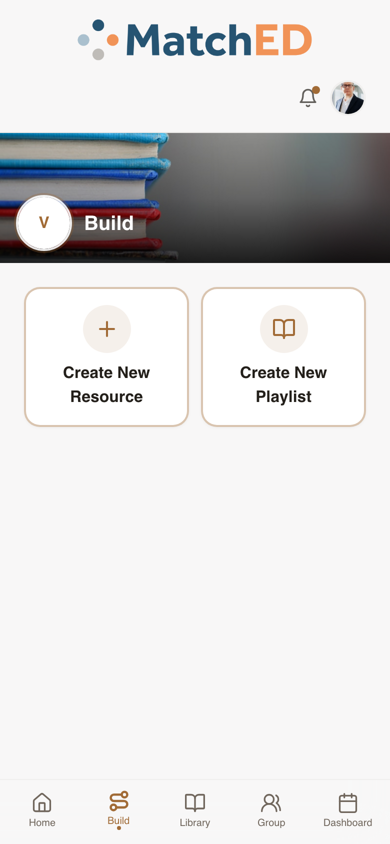
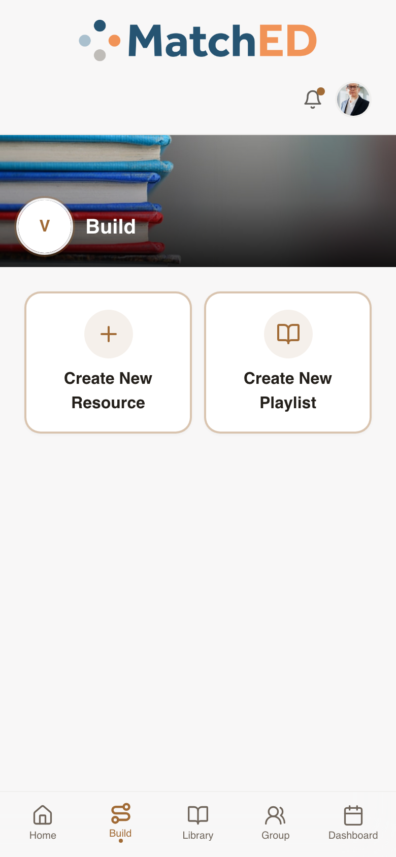
Vendor Playlist Builder + Verified Badge
Vendors can now package multiple resources into a curated, sequenced playlist — think "Apologia 6th Grade Bundle." Members adopt it with one tap. Playlists appear in Search and Library with a Verified badge so members know it's vendor-curated, not random.
What was delivered
- Build tab now shows two entry points: Create New Resource and Create New Playlist
- Playlist form: name, description, optional pricing, and resource picker
- Add from vendor's own catalog or search all of MatchED — tab-switch picker
- Drag / up-down reorder + remove affordance per added resource
- Publish CTA — playlist appears in Search and vendor's Library immediately
- Verified badge on all member-facing surfaces (Search, Library, playlist detail)
Talking point: "Vendors have always had individual resources, but now they can package their best thinking into a full curriculum journey. A vendor's opinionated bundle — with a Verified badge — is a huge trust signal for a homeschool parent who doesn't know where to start."
📱 Build tab — choose what to create
📱 Playlist form — name, resources, price
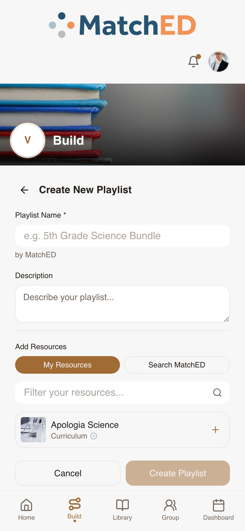
🖥 Build tab — desktop
localhost:5173/profile?tab=build
🖥 Playlist form — desktop
localhost:5173/profile?tab=build
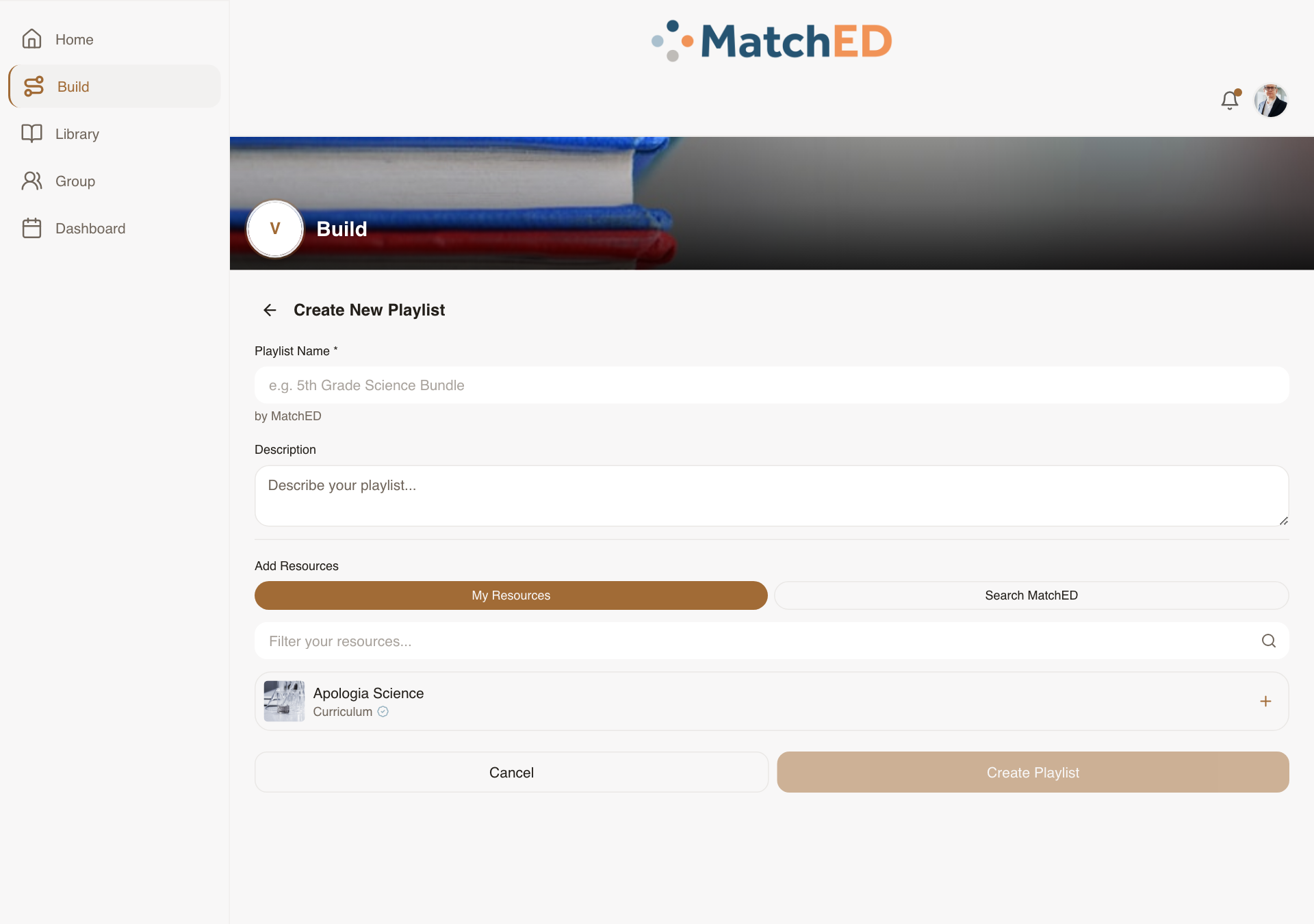
Vendor Listing CRUD — Edit, Archive & Restore
Before this, a vendor who published a resource with a typo had no way to fix it. Now every published listing has a full management lifecycle: edit it in-place, archive it when retired (without losing purchase history or reviews), and restore it later if it comes back.
What was delivered
- Edit affordance on every Library card — reopens Resource Builder pre-filled
- Save updates the live listing in Search immediately
- Archive with confirm modal — listing leaves Search but stays in purchasers' history
- Reviews on archived resources remain visible to members
- Restore (re-publish) from the Archived filter in Library
- No hard delete — all historical purchases and reviews stay valid
Talking point: "Vendors will make mistakes — wrong price, outdated description, retired curriculum. Now they can fix any of it without losing the trust signals (reviews, purchase count) they've already earned. Archive is intentionally soft: nothing disappears for families who already bought it."
📱 Vendor Library — edit & archive
📱 Build tab — manage listings
🖥 Vendor Library — desktop
localhost:5173/profile?tab=library
🖥 Build tab — desktop
localhost:5173/profile?tab=build
Responsive Parity Sweep — Every Screen at Every Breakpoint
A methodical audit of every shipping surface at 390px, 768px, 1024px, and 1440px — comparing each against Carlee's Lovable intent and patching wherever the export drifted. No redesigns, no new components — purely restoring what Carlee built on every device a parent might use.
What was delivered
- All Member surfaces verified: Home, Search, Library, Friends, Calendar, Profile
- All Vendor surfaces verified: Launchpad, Build, Library, Dashboard tabs
- Shared surfaces verified: Auth, Onboarding, Cart, Payment
- Breakpoints covered: 390px (phone) / 768px (tablet) / 1024px (iPad) / 1440px (desktop)
- Layout bugs patched inline; edge cases filed as sub-tickets for Daniel
- Zero P0 layout regressions at any breakpoint before launch
Talking point: "Andrew's direction from May 14 was: after Stripe and Vendor, make everything responsive. This was that work — a full sweep of every screen at every screen size. A parent who opens MatchED on her iPad now gets exactly what Carlee designed, not a stretched phone layout."
📱 Member home — 390px
📱 Search — 390px
🖥 Member home — 1280px
localhost:5173/
🖥 Search — 1280px
localhost:5173/search
Push Notification Settings Screen
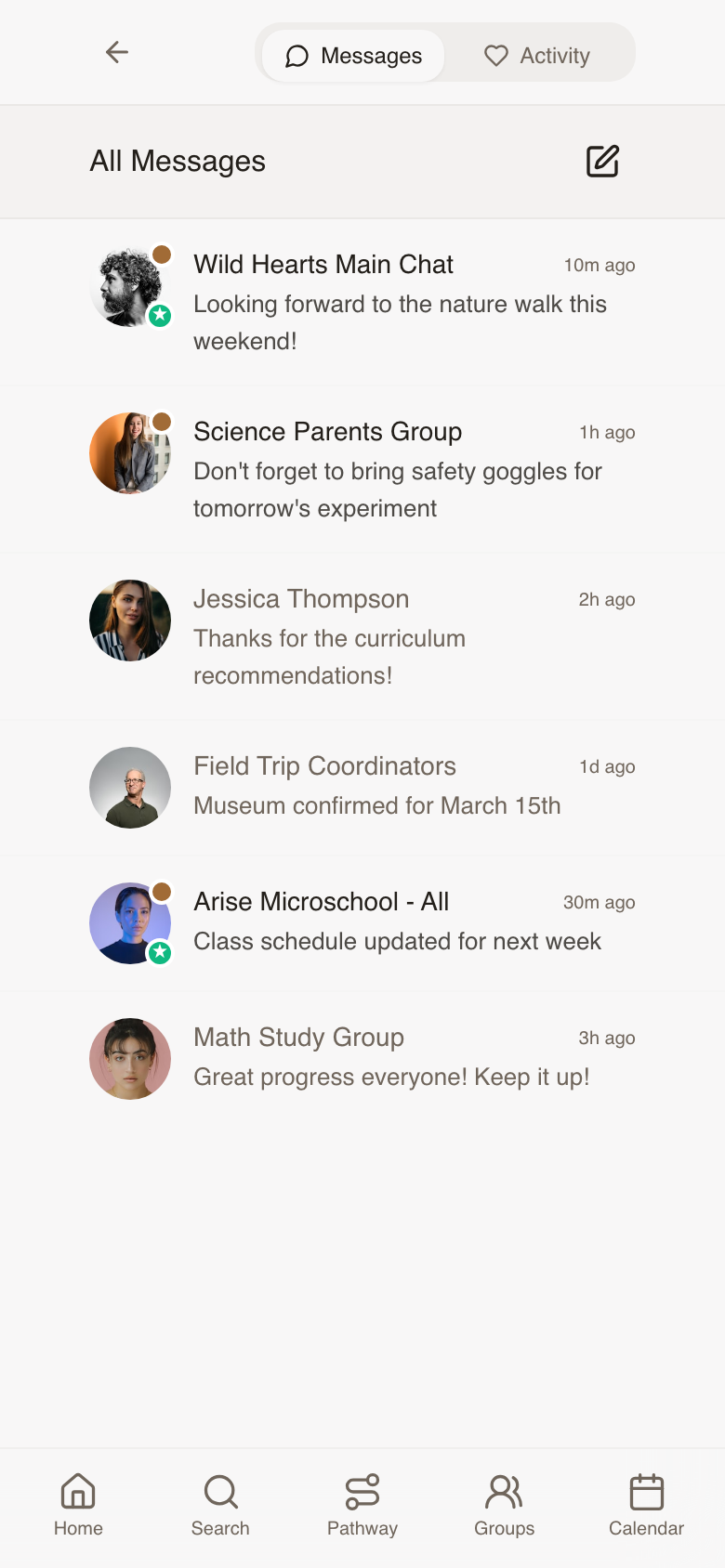
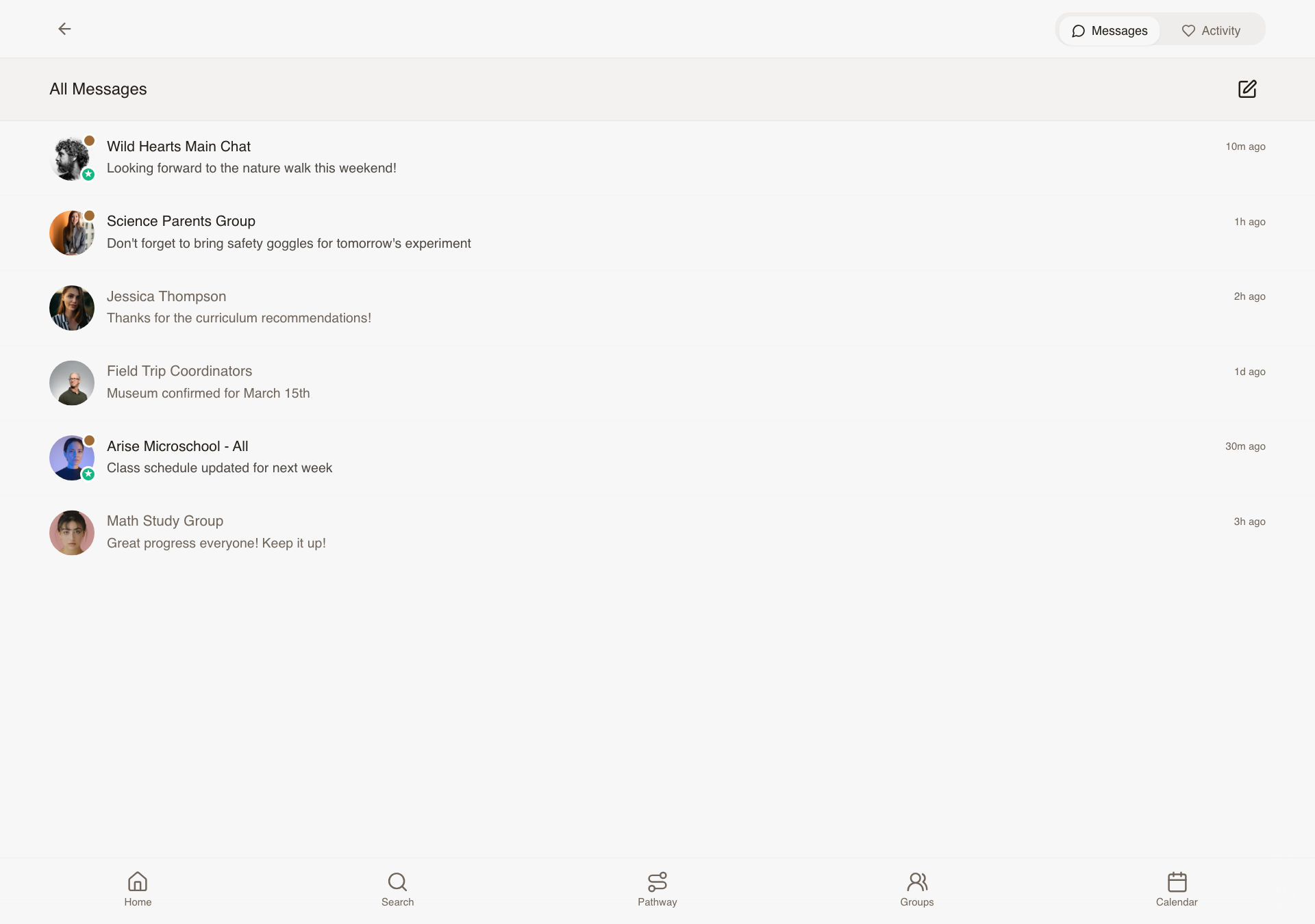
The Profile menu linked to "Notification Settings" but the screen didn't exist — Brian designed it from scratch. Every parent can now choose exactly what reaches them: per notification type, by channel, and per group or friend. Notification fatigue is real; this makes MatchED a platform people trust in their pocket.
What was delivered
- Per-type opt-in: Group activity, Friend requests, Vendor bookings, Paid feature reminders
- Channel selector: Push / Email / SMS — SMS and Email gated by PR2/PR3 subscription
- Per-group mute: silence a specific co-op's activity without leaving
- Per-friend mute: stop updates from a specific connection
- All settings persist immediately — no Save button needed
- Responsive across mobile, iPad, and desktop
Talking point: "This screen didn't exist in Lovable — Brian designed it. Every homeschool parent is already drowning in notifications from a dozen apps. MatchED earning a place in her notification tray means giving her full control from day one."
📱 Notification Settings — mobile
🖥 Notification Settings — desktop
localhost:5173/notifications
Phase 5 — Messaging, Pathway & Subscriptions
Cycle 5 · June 9–13, 2026
8 tasks
Messages List — Conversation Type Labels & Visual Differentiation
Every conversation in the All Messages list used to look the same, so a parent couldn't tell a one-on-one chat from a whole co-op announcement without opening it. Now each row carries a color-coded badge and a plain-language label, so parents can scan their inbox and know instantly what they're looking at.
What was delivered
- Four conversation types distinguished: direct message, main group chat, sub-group chat, and announcements
- Color-coded avatar badge per type, each with its own icon
- Readable label chip on every row ("Direct message," "Main chat," "Group chat," "Announcements")
- Sample inbox expanded so all four types are visible when reviewing the list
Talking point: "Before this, every message in the inbox looked identical. Now a parent can glance at her messages and immediately know whether it's a private note from a friend or an announcement from her co-op leader."
Checkout Cart Polish — Multi-Vendor Checkout & Promo Codes
A parent's cart can easily hold items from several vendors at once: a curriculum resource, a paid class sign-up, a group membership, a booked session. This update makes that mixed cart feel calm and organized instead of confusing. She can check out one vendor at a time, see exactly what type of item each thing is, and apply a promo code, all without being forced to buy everything at once.
What was delivered
- Vendor groupings that expand and collapse, each with its own "Pay" button
- Per-item checkboxes so a parent can choose exactly what to buy now versus save for later
- Color-coded labels on every item showing its type (resource, sign-up, group access, booking, subscription), with dates or billing frequency shown inline
- Promo code field with a clear success message or friendly error if the code doesn't work
- Affiliate credit shown as its own line item when it applies, naming the vendor and the amount
Talking point: "Parents are going to have a mix of things in their cart, resources, sign-ups, subscriptions, all from different vendors. This makes sure the cart stays clear and in her control instead of feeling like a forced checkout funnel."
Upgrade Prompts for Premium Features
When a free member taps into a feature that requires a paid plan, she now sees a friendly upgrade invitation instead of a dead end or a confusing error. The same easy-to-understand prompt appears whether she's trying to build a transcript, turn on text message notifications, or (for a co-op leader) enable group announcements, so members only have to learn the pattern once.
What was delivered
- A single, consistent upgrade prompt design used across all three premium features: Records & Reporting, Member Communications, and Group Communications
- Each prompt names the feature, explains what she'll get, and shows the price, with "Subscribe" and "Maybe later" buttons
- "Maybe later" dismisses the prompt and won't nag her again on that same feature for 24 hours
- Handles the case where a member is already subscribed to one plan and hits a different paid feature, showing the right upgrade path instead of double-charging logic
- Group leaders already in a free trial period don't see the upgrade prompt, since they're already covered
Talking point: "We wanted upgrading to feel like an invitation, not a wall. Whether she hits the transcript tool, texting, or group announcements, she sees the same friendly, consistent prompt, so she learns it once and trusts it everywhere."
Playlist Builder — Guided Curriculum Planning Flow
Planning a school year can feel overwhelming when you're staring at a blank page. This guided, step-by-step flow walks a parent through building a curated learning playlist for her family or a specific child: pick who it's for, choose how to build it, then fill in each subject with resources from her groups, her friends, or a search of the full library. It ends with one clean list she can review and add to her cart.
What was delivered
- Step 1: choose whether the playlist is for the whole family or a specific child
- Step 2: choose to build it herself or start from a ready-made template
- Step 3: a subject-by-subject grid for the child's grade level, where tapping a subject opens suggestions pulled from her groups, her friends, a library search, or her own picks
- A running list that builds as she makes selections, with selections preserved if she navigates back
- A final review screen showing all chosen items with prices, vendor breakdown, and one-tap "Add All to Cart" or "Save Playlist" options
Talking point: "This turns 'plan my kid's whole school year' from a blank, intimidating page into a guided conversation. She's never stuck wondering what to do next, and by the end she has a real, priced-out plan."
Subscription Management & Purchase History
Two related screens that give parents full visibility and control over their money on MatchED. The billing page lets a subscriber see and manage every paid plan she has in one place. The purchase history page lets any parent look back at everything she's bought and pull a receipt, which matters most for families claiming state education reimbursement (ESA) funds.
What was delivered
- Billing page listing every active subscription with its status (active, past due, canceled), price, and next billing date
- One-tap actions per subscription: change plan, cancel, or update payment method, plus a clear prompt if a payment is past due
- A "Subscribe" section showing plans she doesn't have yet
- Purchase history list showing every order with vendor, amount, date, and item type, filterable by year, child, or vendor
- Per-order "Export receipt" button that produces a reimbursement-friendly PDF receipt
Talking point: "This is where a parent goes to feel in control of her money on MatchED, whether that's switching her subscription to annual billing or pulling a receipt for her state reimbursement paperwork. No support ticket required."
Transcript Builder
A real, printable high school transcript that a parent can hand to a college admissions office with confidence, not something she has to explain or apologize for. This is the headline feature behind MatchED's Records & Reporting plan, and it walks a parent through setting up her school info, entering courses grade by grade, and getting an automatically calculated GPA and credit total at the end.
What was delivered
- School setup: school name, logo upload, and a choice between letter grades or mastery-based grading
- Optional weighted grading for AP and Honors courses, with parent-defined weighting values
- Per-grade course tables (grades 9 through 12 by default) with course name, both semester grades, and credits
- An automatically updating academic summary showing per-year GPA, cumulative GPA, and total credits as she enters courses
- Certification statement, signature, and date fields, plus Save, Print, and Download-as-PDF options
Talking point: "This is the flagship feature parents are paying for. A mom can sit down, enter her son's high school courses, and walk away with a real, professional transcript she'd hand to a college without a second thought."
Attendance Log
Many states require homeschool families to log a set number of instructional days per year, and this gives parents an easy daily habit for doing it. She taps today's date for each child, sees at a glance how many days she's logged toward her state's requirement, and can export a compliance-ready report at year end.
What was delivered
- A month-by-month calendar per child, with a single tap to mark a day attended
- A switcher for families with more than one child, so each child has a separate log
- A running summary at the top ("X of Y school days logged") with an estimated finish date based on her current pace
- Configurable school year start date and required number of days
- Export to a PDF report with school name, child name, dates attended, and total days, reusing the same PDF system as the Transcript Builder
Talking point: "This is meant to be a 10-second evening habit, not a chore. She taps today's date for each kid, sees her progress toward her state's requirement, and at the end of the year she has a compliance report ready to go."
Pathway Hub & Family / Student Library
The home base for a family's whole learning life on MatchED. Four tiles give a parent an instant snapshot: what she's planning, what she's saved, what's been recorded, and what she's purchased. From there, the Library lets her browse everything she's saved for the whole family or drill into one specific child's collection, which matters most for families juggling multiple kids at different grade levels.
What was delivered
- Four-tile Pathway Hub (Build, Library, Records, Purchases), each showing a live snapshot like "5 active playlists" or "$240 this school year"
- A gentle, encouraging empty state for brand-new families instead of a blank screen
- Library with a tab switcher between the whole-family view and a view per child, organized by grade
- Resource cards reuse the same familiar design from Search results, so parents don't have to learn a new visual pattern
- Filtering by subject, type, and source, plus the ability to move a saved resource from one child's library to another's
Talking point: "This is the front door to everything a family has built on MatchED. Four tiles tell her at a glance where things stand, and the Library lets her see her saved resources as one family or drill into exactly what's saved for each kid."
Phase 6 — Playlist Builder Refinement
Cycle 6 · June 16–19, 2026
13 tasks
Header Redesign — Logo Gets Its Own Row on Phones
On a phone screen, the MatchED logo now sits centered on its own row, with the bell, cart, and profile icons lined up neatly underneath. On tablet and desktop, where there's more room, everything shares one clean row. This came directly out of the June 10 design review with Carlee.
What was delivered
- Mobile: logo centered on row one, bell/cart/avatar right-aligned on row two
- Desktop and tablet: logo and icons share a single row, logo centered via flexible spacing
- Logo stays vertically centered at every screen size, with no jump or shift when resizing
Talking point: "This is straight from your June 10 notes. On a phone, the logo needed room to breathe instead of competing with the icons, so we gave it its own row and let desktop stay compact."
Icon Colors — Warm Brown at Rest, Orange When Active
Carlee felt the navigation icons looked too cold and gray in their default state. Every icon across the bottom nav, header, and Pathway Hub now rests in a soft warm brown that matches the MatchED palette, and switches to the signature orange only when it's the one you've tapped.
What was delivered
- New warm brown color applied to bottom nav icons (Home, Search, Groups, Calendar)
- Same treatment applied to header icons (bell, shopping cart) and the Pathway Hub tile icons (Build, Library, Records, Purchases)
- Orange reserved strictly for the active/selected icon, no more dark gray anywhere in navigation
Talking point: "You called this out yourself, the icons felt cold. Now everything at rest has that warm, earthy tone, and orange only shows up to tell you where you are."
Playlist Builder: Family Card Now Matches the Student Cards
On the first screen of the Playlist Builder, where a parent picks who the playlist is for, the Family option used to show a little house icon that didn't mean anything to anyone. It's now the same simple arrow used on every student card, so the whole screen feels consistent.
What was delivered
- Home icon removed from the Family recipient card
- Replaced with the same right-pointing arrow used on student cards
- Recipient selection screen now uses one consistent visual pattern throughout
Talking point: "You said in the meeting you weren't sure why there was a house icon there, so we pulled it and matched it to the same arrow every other card uses. Small fix, but it makes that screen feel intentional."
Playlist Builder: Simplified Subject List, 8 Down to 6
The subject grid in the Playlist Builder was showing eight separate core subjects, including Reading, Writing, and Grammar as three different boxes. Following the June 10 meeting, those three now live under one combined "Language Arts" subject, so parents see a cleaner set of six clear choices instead of a cluttered list.
What was delivered
- Grammar, Reading, and Writing removed as standalone subjects, folded into Language Arts
- Six core subjects now shown in a 2-column, 3-row grid: Math, Language Arts, Science, History, Bible/Faith, and Physical Education
- Subjects appear in the exact order agreed on in the design meeting
Talking point: "Eight boxes was too many decisions at once. Combining Reading, Writing, and Grammar into Language Arts gets parents to six clear choices instead, exactly the layout Andrew and the team landed on."
Playlist Builder: Extras Are Now Optional, Not a Wall of Boxes
Below the core subjects, there used to be a full grid of elective subjects a parent had to scan through, whether they needed them or not. That's been replaced with three simple, optional buttons for Extracurriculars, Artifacts, and Custom Subjects, so nothing extra shows up unless a parent actually wants to add it.
What was delivered
- Full electives grid removed from the subject step
- Three stacked "Add" buttons in its place: Add Extracurriculars, Add Artifacts, Add Custom Subject, all marked optional
- Each button opens the right input for naming and adding that item
- Outlined, dashed-border style keeps them visually distinct from the required core subjects
Talking point: "We didn't want parents feeling like they had to fill out an elective for every kid. Now it's three simple, optional buttons, add what applies to you and skip the rest."
Playlist Builder: Cleared the Clutter Off the Subject Screen
Carlee said it plainly in the June 10 meeting: the progress bar on the subject step "should actually just be gone." The playlist name text sitting at the top of that same screen was also just noise. Both are now removed, leaving the subject step feeling lighter and more focused.
What was delivered
- Progress bar removed from the subject selection screen
- Playlist name text removed from the top of the same screen
- Subject step now shows only what a parent needs to make decisions
Talking point: "This one's a direct quote from you, the progress bar just needed to go. Pulling that and the playlist name off the top makes the whole screen breathe a lot easier."
Playlist Builder: Smarter Suggestions When Adding Resources
When a parent taps a subject to find curriculum for it, the sheet that opens now leads with a curated "Top Picks" style section tailored to that student's grade and family profile, instead of dropping them into an empty browse screen. The "Library" tab has also been renamed "MatchED Search" so it's clear what it actually does, and there's one less tap to reach the content itself.
What was delivered
- "Library" tab renamed to "MatchED Search," which opens search pre-filled with the selected grade and subject
- New recommendations section added above the tabs, personalized to the student's grade and family profile
- Removed the extra "View Full Playlist" tap, so resource content shows immediately when the sheet opens
Talking point: "Instead of handing parents a blank search box, we now show them picks tailored to their kid's grade right away, and we cut out an extra tap it took to get there."
Playlist Builder: "Add Your Own" Now Builds a Real Resource Card
If a parent is using a curriculum that isn't in MatchED yet, "Add Your Own" used to be a bare-bones form with just a title, vendor, and price. It's now a proper resource card creator, matching the same card format used everywhere else in the app, with a photo, description, and optional price. Importantly, anything created this way stays completely private to that family's own library and never shows up in MatchED Search for other members.
What was delivered
- Full resource card creator with thumbnail upload, title, description, and optional price
- Completed card appears in the parent's playlist under the correct subject
- Card is saved only to that parent's personal library, never published to MatchED Search or the shared community library
Talking point: "Every family uses something MatchED doesn't carry yet. Now they can add it properly with a photo and description, and per Andrew's privacy rule, it stays completely private to their own library."
Playlist Builder: See the Running Total as You Build
Previously, a parent building a playlist had no idea what it would cost until they reached the final Review step. Now, the total updates live as soon as items are added to any subject, so there are no surprises at the end, much like watching a subtotal update as you shop online.
What was delivered
- Running price subtotal now visible throughout the subject-filling step, not just at Review
- Subtotal updates live as items are added to or removed from any subject
- Final Review button now reads "Add All [N] Items to Cart, $XX.XX" showing both count and total
Talking point: "Nobody likes getting to checkout and being surprised by the number. Now the total climbs right along with them as they build, just like a shopping cart."
Playlist Sharing: Kids' Names and Photos Stay Private
When a parent shares a playlist with a group or friends, other members should never see the actual student's name or photo attached to it. This was a firm privacy decision the whole team agreed on in the June 10 meeting. A shared playlist now reads something like "Carly's 6th Grade Playlist," crediting the parent instead of exposing the child.
What was delivered
- Student name and student photo hidden from anyone other than the account owner
- Shared playlists now display the parent's first name and grade level instead, e.g. "Carly's 6th Grade Playlist"
- Applied consistently across group feeds, friend-shared playlists, and any "Shared with Me" view
- The account owner's own view is unchanged, they still see their child's name and photo as normal
Talking point: "This was a privacy line everyone in the room agreed on. Nobody outside your own account should ever see your kid's name or face, so shared playlists are now credited to the parent instead."
Playlist Builder: Fixed Oversized Cards and Awkward Review Layout
Two quick follow-up fixes after the subject-step changes shipped. The recommendation cards were rendering too tall, so parents could barely see one row of picks without scrolling. And on the Review screen, the "Add to Cart" and "Save Playlist" buttons were pinned to the bottom of the screen, leaving an odd, empty gap above them instead of sitting right below the order summary the way checkout screens normally work.
What was delivered
- Recommendation card images resized to a shorter, fixed height so more picks are visible at once without scrolling
- Review page CTA buttons moved inline directly below the price subtotal, matching standard checkout layout
- Review screen width tightened so it reads cleanly on both phone and desktop
Talking point: "Once we saw the new subject step live, a couple of spacing issues jumped out, cards too tall, buttons floating oddly at the bottom. Quick cleanup and the Review screen now reads like a normal checkout."
Playlist Builder: Consistent, Responsive Layout Across Every Step
A broader pass to make the whole Playlist Builder feel like one unified tool rather than a series of loosely related screens. The grade picker and subject cards now resize gracefully whether a parent is on a phone, iPad, or desktop, and the Groups tab (where shared playlists live) got a full visual refresh to match Carlee's designs, with clear subject breakdowns instead of a plain list.
What was delivered
- Grade picker and subject cards now use a responsive grid that adds columns as screen size grows, with a shorter, fixed card image height
- Subject step, suggestion sheet, and footer buttons all aligned to the same column width for a cohesive look
- Groups playlist view redesigned with group name, style tag, Core Subjects and Extracurriculars sections, resource thumbnails, and a "+N more subjects" count
- Search added to Groups view to filter by group name or resource title
Talking point: "This was the tidy-up pass, making sure the Playlist Builder looks and feels the same whether you're on a phone or a big desktop screen, and giving the Groups tab the same design polish as the rest of the wizard."
Group Admin: Export Member Contact Lists (Premium Feature)
A new feature for co-op leaders and group admins on MatchED's premium subscription tier. From Group Settings, an admin can now export her group's contact list with full clarity on who is included, since some members opt out of being shared. She can download a CSV or have it emailed straight to her inbox, and the design makes this feel like a polished, trustworthy paid feature rather than a buried settings option.
What was delivered
- "Member Contact List" section added to Group Settings, visible only to admins of premium-tier groups
- Confirmation modal shows exactly how many members are included versus opted out before anything is exported
- Two export options: Download CSV or Share to my email, each with its own success confirmation
- Clear error handling for permission issues, generation failures, and email send failures, each with a retry path
Talking point: "This is a premium feature, so it needed to feel like one. A co-op leader can see exactly who's in and who opted out before she exports anything, and she can download it or send it straight to her own email."
Phase 7 — Discoverability & UX Polish Sweep
Cycle 7 · June 23–26, 2026
7 tasks
Cart Sheet Width Fix — Desktop
A quick but important catch from reviewing the cart work below: on a wide desktop screen, the cart panel was stretching edge to edge, with buttons that looked stretched and out of place. It's a small thing, but it's the kind of detail that makes an app feel unfinished if left alone.
What was delivered
- Cart panel now constrained to a comfortable, readable width on desktop instead of filling the full browser window
- Panel is centered rather than stretched, matching how other slide-out panels behave on larger screens
- Buttons and content inside the cart no longer look stretched or oversized
- Fix applied consistently to both the global cart and the standard cart sheet
Talking point: "We caught this while reviewing the cart polish work, so we fixed it right away. On desktop, the cart used to stretch across the whole screen, now it sits in a clean, centered panel like the rest of the app."
Member Experience Polish — Findability & Clarity Pass
A round of small fixes to the member side of the app, all things that came out of reviewing the original designs closely. None of these change what Carlee built, they just make it easier for a parent to find what she needs and understand what she's clicking. Things like Friends being buried in a dropdown menu, or a "Tap to add" label that doesn't make sense on a laptop.
What was delivered
- Friends moved out of the profile dropdown into a more discoverable spot, since it powers the Friends filter in Search and sourcing in Playlist Builder
- "Tap to add" copy on the Playlist Builder subject cards updated so it reads correctly on desktop, not just touch devices
- Tutorial now surfaces for first-time users automatically, plus a help icon in the header, instead of being hidden in the profile dropdown
- Notifications bell added to the header alongside search and cart, where members expect it
- "Add to Cart" on paid events relabeled to "Register & Pay" so the payment step is never a surprise
- Profile picture menu given a proper accessible label ("Account menu") rather than being an unlabeled avatar
Talking point: "This was about tightening up the member side, not changing Carlee's design. Friends is easier to find now, the Tutorial actually shows up for new users, and paid events say so upfront instead of hiding behind a generic cart button."
Cart & Checkout Polish — Per-Vendor Grouping
Cleanup around the cart and Stripe checkout experience. The cart already grouped items by vendor, but it wasn't clear whether a parent could check out one vendor at a time, so that got clarified and built out with subtotals. This also covers the button placement work that unblocked Daniel's Stripe integration.
What was delivered
- Cart now supports per-vendor grouping with subtotals, so a parent buying from multiple vendors can see costs broken out clearly
- Design intent for per-vendor checkout clarified and handed off for the Stripe integration
- Apple Pay and Venmo button placements finalized per Stripe and Apple's design guidelines, following the Stripe enablement spike
- Payment-success and payment-failed states scoped and handed to Daniel to complete the Stripe wiring (full designs delivered separately)
Talking point: "We tightened up the cart and checkout flow so buying from multiple vendors at once actually makes sense, with subtotals per vendor. This also cleared the way for Daniel to finish wiring up Stripe."
Vendor Experience Polish — Clarity & Monetization Pass
A round of fixes to the vendor side of the app aimed at reducing confusion and surfacing the features that help vendors succeed (and help MatchED earn revenue). A vendor opening their dashboard shouldn't have to guess what a tab means or how urgent a pending request is.
What was delivered
- Vendor sidebar "Group" tab clarified so it's obvious what it represents, rather than leaving vendors to guess
- Vendor "Library" tab given clearer labeling so it reads as the vendor's own published resources, not all of MatchED
- One-line Premium Analytics upsell added to Vendor Home, with pricing shown, instead of being buried inside the Analytics tab
- Confirmations queue now shows SLA cues like "Submitted 2h ago" so vendors know how urgent a pending request is
- Affiliate Agreement form now includes an inline note explaining what happens next when a vendor has their own agreement
Talking point: "This pass was about making the vendor dashboard self-explanatory. Vendors now see at a glance how urgent a pending booking is, and the Premium Analytics upsell is finally visible where vendors will actually see it."
Pathway Polish — Transcript & Attendance Friction Fixes
Two focused fixes to Pathway, MatchED's record-keeping hub for homeschool families. Building a transcript by typing in every single course by hand was a lot of friction, and the attendance log gave parents no quick sense of how they were tracking toward their school-year goal.
What was delivered
- Transcript Builder can now auto-fill from a family's playlists and library completions, with manual entry still available as a fallback
- Attendance Log now shows a streak/summary header ("X of Y school days logged") for an at-a-glance compliance check
Talking point: "Parents were manually typing every course into their transcript. Now Pathway can pull from what they've already logged, and the attendance page shows their progress at a glance instead of making them do the math."
Groups & Sign-Ups Polish — Clarity Pass
A set of clarity fixes across Groups, the Bulletin, and event sign-ups. Small ambiguities, like not knowing how many slots you're committing to, or not realizing a "Register" button also means "and pay $5", add up to real friction for a busy parent trying to get her family signed up for something.
What was delivered
- Sign-up flow now shows a running total ("You're signing up for X of Y") so parents know exactly what they're committing to before confirming
- Calendar event RSVP CTA now states the price directly ("Register for $5") so paid events are never a surprise
- Group Settings "Open" toggle now includes an explainer describing what happens when a group is switched to instant-join
- Bulletin filter row added so members can filter posts by type (Event, Sign-up, Sale, Prayer Request, etc.)
Talking point: "We cleaned up a handful of spots where parents were left guessing, like how many sign-up slots they were claiming, or whether an event actually cost money. Small clarity wins, but they matter when someone's juggling five kids' schedules."
Empty States Sweep — Every Surface, First-Time Experience
Every screen looks great once it's full of content, but a brand-new vendor or a family who just joined a group sees a blank page first. This sweep designed and built a thoughtful empty state for every major surface in the app, so day one never feels broken or unfinished. This work wasn't part of Carlee's original designs, it's new ground the team filled in.
What was delivered
- Vendor surfaces: empty states for no resources yet, empty Confirmations queue, and a first-day Vendor Dashboard with no data
- Member surfaces: empty states for no playlists, zero friends, no Friends Discover matches, and an empty personal Calendar
- Groups surfaces: empty states for a Group Feed with no posts, no events, no sign-ups, an empty Bulletin, and a Subgroups list with none yet
- Records: empty states for no transcripts created yet and no attendance logged yet
- Search with no results and an empty Cart both given proper guidance instead of a blank screen
- Payment-success and payment-failed post-checkout states included as part of this same sweep
Talking point: "First impressions matter, and a blank screen reads as broken. We went surface by surface, twelve of them in total, and made sure day one always feels intentional, whether you're a brand-new vendor or a family who just joined their first group."
Phase 8 — Groups Redesign & Brand Refresh
Cycle 8 · July 1–2, 2026
17 tasks
Site-Wide Visual Consistency — Card Shapes, Spacing & Proportions
Before diving into the Groups redesign, we set a single ruleset for how every card in the app looks: corner rounding, inner padding, and image proportions. Andrew's direction was "think Apple Store, not CVS" — cards should feel curated and portrait or square, never squat and wide. Fixing this at the base level means future changes cascade everywhere instead of needing to be patched card by card.
What was delivered
- Unified corner rounding across event cards, resource carousels, and every other card in the app (no more mismatched sharp vs. rounded corners)
- Standardized image proportions with a shared aspect-ratio system, replacing inconsistent hardcoded sizes
- Evened out inner card padding so spacing feels consistent from card to card
Talking point: "This is the plumbing behind everything you'll see in this update. We set one consistent shape and spacing rule for cards across the whole app, so as we polish Groups and everything after it, it all matches instead of drifting apart."
Brand Refresh — New Signature Color Across the Whole App
MatchED's primary accent color was updated app-wide, replacing the old orange with the new warm terracotta-brown (#A06B35) tone. Because the color lives in one central design setting, updating it there means every button, badge, and highlight across the entire app updated together, consistently, in one pass.
What was delivered
- New brand color applied consistently across all screens and components
- Change made at the design-system level, so nothing was missed or left mismatched
Talking point: "You'll notice the new color right away, it's everywhere now. Because we built this on a proper design system, we didn't have to hunt down every button one at a time. Change it once, it updates everywhere."
Fixed: "Join Group" Was Throwing an Error
We found and fixed a bug where tapping "Join Group" could return an error instead of actually adding the member. On top of the fix, we redesigned the celebratory "You're In!" screen that appears right after joining, so the moment a parent joins a group now feels welcoming and gives her a clear next step to explore it.
What was delivered
- Fixed the underlying error so Join Group works reliably every time
- Redesigned the post-join "You're In!" confirmation screen with an "Explore Group" call to action
- Successful join now takes the member straight into the group page
Talking point: "We caught a real bug here, joining a group could fail with an error, which is about as bad a first impression as it gets. It's fixed now, and we used the opportunity to make the join moment feel more welcoming too."
New: Members Can Now Leave a Group
Until now there was no way for a member to leave a group she'd joined. We added a clear "Leave Group" option to the group page, with a confirmation step so nobody leaves by accident.
What was delivered
- "Leave Group" option added to the group page for members
- Confirmation step before leaving, to prevent accidental taps
Talking point: "Small but important, families outgrow groups or change co-ops, and they need an easy, safe way to leave one. That option exists now, with a confirmation so nobody leaves by mistake."
Group Page Tabs — Cleaner, More Compact Desktop Layout
On desktop, the tabs inside a group (Bulletin, Resources, Events, and so on) used to spread all the way across the screen, which felt loose and disconnected. They now sit together in a neat, centered panel with icons next to their labels, so the navigation reads as one cohesive control instead of scattered links.
What was delivered
- Group page tabs redesigned into a compact, centered panel on desktop
- Icon and label now sit side by side on each tab
Talking point: "This is a small visual change that makes a big difference on a laptop or desktop screen. The tabs inside a group used to feel spread out and disconnected. Now they're grouped together, so it reads as one clean navigation bar."
Group Cards — Bigger, More Square Photos
Carlee flagged that group card images felt too thin and cropped for real uploaded photos, like a field trip or activity shot. We made the image area taller and closer to a square shape, so photos have room to breathe while staying cropped cleanly with no stretching or distortion.
What was delivered
- Group card image height increased for a more square proportion
- Images stay cleanly cropped with no stretching or distortion
- Verified across the scrolling carousel and grid views, on mobile, tablet, and desktop
Talking point: "This one came straight from you, Carlee, you noticed the group photos felt too narrow for real activity pictures. They've got much more room to shine now, on every device."
Groups Homepage — Welcoming Banner & Smarter Search
Ahead of group leader onboarding, the Groups homepage got a refresh based on Carlee's feedback from our weekly meeting. There's now a persistent welcome banner above "Your Groups" with a friendly invitation to connect and a clear "Create New Group" button, the redundant "Search Groups" button was removed, and the main search bar now returns results as you type instead of requiring you to press Enter.
What was delivered
- New persistent banner above "Your Groups" with copy, an image, and a "Create New Group" button, left-aligned with the sections below it
- Removed the redundant standalone "Search Groups" button
- Search bar now returns results automatically as you type, no need to press Enter
- Added breathing room above the header for better visual balance
Talking point: "This came directly out of our weekly session, Carlee. The Groups homepage now leads with a warm invitation to connect instead of a bare list, and search feels instant, results show up as you type."
Resources Tab — Consistent Cards, Cleaner Desktop Layout
Inside a group's Resources tab, cards used to vary in size and stretch edge-to-edge on desktop with no margins. Carlee asked for fixed, consistent card sizing and the same comfortable side margins we've been applying elsewhere in the app. Both are now in place.
What was delivered
- Resource cards are now a uniform, consistent size within the tab
- Desktop view now has proper left and right margins instead of stretching edge-to-edge
- Mobile's horizontal scrolling layout was preserved and unaffected
Talking point: "You flagged that the Resources tab felt inconsistent, cards different sizes, content running edge-to-edge on a wide screen. That's cleaned up now, everything lines up the way it does across the rest of the app."
Events Tab — Single-Column Layout to Match the Rest of the App
The Events tab inside a group had a layout on desktop that Carlee described as "looks funky" — mismatched cards that didn't fit the rest of the app's style. Upcoming events now display in a clean single column, the same list style used for the groups listing, with the same comfortable side margins applied elsewhere.
What was delivered
- Upcoming events now render in a single-column list on desktop instead of the old mismatched multi-column layout
- Applied the same left/right margin constraint used across other sections
- Mobile layout was left unaffected
Talking point: "This was the 'looks funky' feedback from our meeting, the Events tab didn't match anything else in the app. Upcoming events now sit in a clean single column that matches the groups list style you're used to."
Fixed: New Playlists Showed 0 Resources After Saving
Brian demoed this bug live in our meeting: creating a new playlist and adding resources to it would save with a label like "curated playlist with 2 resources," but opening the playlist showed an empty list. We traced this to the resources not actually being saved to the playlist behind the scenes, and fixed the save process so they now persist correctly.
What was delivered
- Fixed the playlist save process so resources added during creation are actually stored
- Playlist detail view now correctly displays every resource that was added
- The resource count shown on a playlist now matches what's actually inside it
Talking point: "We actually caught this live in our meeting together, a new playlist would claim it had resources in it but show nothing when you opened it. That's a real trust issue for a vendor building a playlist, and it's fixed now."
Cleaned Up Group Navigation — Removed an Unintended Tab
During our July 1 design session, we spotted a "Reviews" tab sitting in the group navigation bar that was never meant to be there for this release. It's been removed, and the rest of the tabs remain correctly ordered.
What was delivered
- Removed the unintended "Reviews" tab from the group navigation bar
- Confirmed remaining tabs are unaffected and in the correct order
Talking point: "You caught this one in our design session, a Reviews tab that snuck into the group navigation and wasn't supposed to be there yet. Quick fix, and the nav bar is clean again."
New Post Form — Post & Cancel Buttons No Longer Buried
Also flagged during the July 1 design session on staging: creating a new post (text, image, or poll) in a group required scrolling all the way to the bottom of the form just to find the Post or Cancel buttons. That's fixed, the same issue in the poll creation form was fixed too.
What was delivered
- Post and Cancel buttons are now reachable without excessive scrolling
- Same fix applied to the poll creation form
Talking point: "This came from our design session on staging, having to scroll forever just to hit Post or Cancel. It's a small thing, but it adds friction every single time someone posts. That friction is gone now."
Events Calendar — Full Desktop Width & Past Events Cleaned Up
Two follow-up items from our July 1 design session that the earlier Events tab work didn't fully cover: the calendar view was stuck at a narrow, mobile-sized width even on desktop, and past events were still showing in the old horizontal scroll instead of the new clean list style. Both are now resolved.
What was delivered
- Calendar (monthly and weekly view) now expands to fill the full available width on desktop
- Past events now display in the same clean vertical list style as upcoming events
Talking point: "You caught two more Events tab issues in our design session, the calendar was still stuck at mobile width on desktop, and past events hadn't gotten the same list treatment as upcoming ones. Both are wrapped up now."
Onboarding — New "Other" Option for Grandparents, Guardians & Caregivers
Not every adult educating a child during onboarding is the parent, sometimes it's a grandparent, guardian, or tutor. We added a fourth "Other" card to the sign-up role picker, alongside Parent, Both, and Leader, so those users feel recognized right from the start rather than forced into a category that doesn't quite fit them.
What was delivered
- New "Other" role card added to the existing role picker, matching the look and feel of Parent, Both, and Leader
- Includes its own icon, label, and short description line
- Confirmed the four-option layout still reads cleanly on mobile, tablet, and desktop
Talking point: "This makes sure grandparents, guardians, and other caregivers feel welcomed on day one instead of having to force-fit themselves into 'Parent.' It sits right alongside the existing options, same look, same care."
Group Creation Form — No More Zooming Required on Desktop
Flagged during our July 1 design session: creating a new group on desktop had scrolling and layout problems bad enough that users had to zoom in and out just to see the whole form. We also found the "Generate Images" AI button in that same form was returning an error, since that feature isn't ready for launch, the button has been hidden until it is.
What was delivered
- Group creation form is now fully visible and scrolls properly at normal desktop zoom, no zooming in or out required
- Hid the "Generate Images" button, which was returning an error and isn't in scope for launch
Talking point: "This was one from our design session, needing to zoom in and out just to fill out the group creation form on a laptop. That's fixed, and we also tucked away the image-generation button that wasn't ready yet so it doesn't dead-end anyone."
Header — More Breathing Room Around the Logo & Icons
Carlee flagged that the header felt cramped, with the logo and the bell, cart, and profile icons sitting too close to the top edge of the page. We increased the vertical padding evenly above and below the logo and icon row across both desktop and mobile, so the header now feels open rather than crowded.
What was delivered
- Increased header height and padding on desktop
- Increased padding around the logo and icon row on mobile
- Padding is equal top and bottom, with no other layout elements shifted
Talking point: "You mentioned the header felt tight, like it was crowding the top of the screen. It's got proper breathing room now, on both desktop and mobile, and nothing else on the page moved because of it."
New Resource & Playlist Forms — Consistent Width on Desktop
The forms for creating a new resource or new playlist were stretching to the full width of the screen on desktop, which felt overwhelming and out of step with the rest of the app. We applied the same 70%-width, centered rule already used elsewhere, and while in there, also bumped up a font size on the course creation form that was too small.
What was delivered
- New resource creation form is now centered at roughly 70% width on desktop instead of stretching edge-to-edge
- New playlist creation form received the same width treatment
- Reviewed and increased a small font size on the course creation form
Talking point: "This was from our staging session together, the new resource and playlist forms were sprawling across the whole screen on desktop. They're centered and sized consistently with the rest of the app now, and we cleaned up a small font issue on the course form while we were in there."
Phase 9 — In Progress & Up Next
Active work and the queued backlog
20 tasks
Group Resources, Playlists & Courses — Matching the Search Card Style
Right now group resources, playlists, and courses don't look like the rest of the app. This work brings them in line with the card design already used in Search, so a parent sees one consistent look everywhere. Cards will also scroll sideways in a single row instead of stacking into a grid, which is how Carlee wants them to feel on both phone and desktop.
What's in progress
- Applying the Search result card design to group resources, playlists, and courses
- Switching each section to a horizontal scroll row on mobile and desktop
- Removing the old multi-column grid layout on desktop
Talking point: "Carlee flagged this in our July 1 design session. The group pages should feel like one app, not a patchwork. I'm matching them to the Search card style now."
Design: Group Notifications — Messages, Activity & Pending Tabs
A group admin or member needs one place to see everything happening in their group and clear it by acting on it. This designs the three-tab notification view (Messages, Activity, Pending) so it feels like one connected system with the notification pages we've already shipped, not a separate style bolted on.
What's planned
- Define what belongs in each of the three tabs and how unread items are marked
- Design the notification row, tap targets, and per-tab empty states
- Reconcile the look with the existing member notification page and push settings screen
- Hand off the finished design so the engineering wiring can begin
Talking point: "This is a design pass, not new engineering yet. Once it's finished, the team can wire up the tabs knowing exactly how they should look and behave."
Playlist Cards — Wider Layout for Desktop
Playlist cards were originally built for a narrow phone screen, so on a desktop monitor they look cramped and undersized. This gives playlists a wider, taller card on bigger screens, similar to how the Library already displays them, while leaving the mobile layout untouched.
What's planned
- Wider, landscape-style playlist cards on desktop screens
- Image and title sized so they're easy to read at desktop scale
- Mobile layout stays exactly as it is today
Talking point: "Carlee wanted playlists to feel 'taller and wider' on bigger screens, closer to the Library look. This is on deck to make that happen."
Design: Subgroups — Linking Groups to Groups
This is a bigger design project that lets one group act as a parent to other groups, for example a state coalition linking to its local co-ops. It covers requesting or inviting a group to become a subgroup, letting a parent group post to all of its subgroups at once, and giving parent admins a console to message subgroup admins and push events for their approval. None of this exists in any prototype yet, so it's being designed from scratch.
What's planned
- Create Subgroup / Request-to-become-a-Subgroup flow, with pending, accepted, and declined states
- "Include Subgroups" toggle on the parent group's post composer
- Admin console: subgroup list plus messaging to one, several, or all subgroup admins
- Push an event to all subgroups, requiring each subgroup admin's approval before it goes live
Talking point: "Subgroups is a meaningful new capability for larger group networks. This design work needs to land before the engineering build starts, so it's queued as a priority."
Event Card Menu Rendering Outside Its Card
The triple-dot admin menu on event cards currently spills outside the card's edges, and the event date overlaps with it. Both need their own clean space inside the card.
Scope
- Contain the triple-dot menu fully within the event card
- Give the event date and the menu separate, non-overlapping space
Talking point: "This is a known layout issue queued for the next sprint. Small visual fix, not a functional one."
Reporting a Resource Doesn't Submit
When a member tries to report a resource, whether it's a broken link, duplicate, or something inappropriate, the report fails to submit. We also need to confirm reports land in an admin queue with an email alert.
Scope
- Fix the report dialog so submissions succeed
- Store submitted reports in an admin "reported resources" queue
- Notify admins by email when a new report comes in
Talking point: "This is a known bug queued for the next sprint. Right now nobody can actually flag a bad resource, which we want fixed before it matters at scale."
Sharing a Resource to a Group Drops the Link
When a member shares a resource into a group feed, it posts as plain text with no link back to the resource, so group members can't act on it from the feed.
Scope
- Shared posts should include a linked resource card, not just text
- Group members should be able to add to cart, save, review, share, or report right from that post
Talking point: "This is a known issue queued for the next sprint. Sharing works, it just doesn't carry the resource along with it yet."
Submitted Reviews Don't Show Up
After a member submits a review on a resource or playlist, it doesn't appear anywhere, and clicking the star rating doesn't show past reviews either.
Scope
- Show submitted reviews below the resource or playlist immediately, and keep them after a refresh
- Clicking the star rating should surface existing reviews for that item
Talking point: "This is a known issue queued for the next sprint. Reviews are being collected, they just aren't being displayed back to users yet, which we want to fix soon since trust signals matter here."
Saving a Playlist to Your Library Doesn't Work
Saving a group playlist looks like it succeeds, but the playlist never shows up in the user's library, and there's no option to choose a specific student versus the family library the way resource saving offers.
Scope
- Saved playlists should actually appear in the user's library
- Add the same student vs. family library choice that resource saving has
Talking point: "This is a known issue queued for the next sprint, and a fairly important one since saving playlists is a core action."
"Add Playlist to Cart" Leaves the Cart Empty
Adding an entire playlist to the cart shows a success message, but opening the cart afterward shows nothing there. The action isn't actually being saved.
Scope
- Adding a playlist should put all of its items in the cart
- Cart should reflect those items right away and keep them across page navigation
Talking point: "This is a known issue queued for the next sprint. It's a checkout-path bug, so it's a high priority for us to close out."
Rename "Downloads" to "Attachments" on Resource Pages
The section that holds files like waivers, schedules, and code-of-conduct documents is currently labeled "Downloads," which doesn't quite describe what's there. Renaming it to "Attachments" is clearer.
Scope
- Update the label from "Downloads" to "Attachments" in the resource detail view
Talking point: "This is a small copy fix queued for the next sprint, straight from Carlee's own notes."
Resource Images Don't Match Across the App
The same resource can show a different image depending on where you're viewing it, for example the group resource list versus the resource's own detail page. We need to standardize which image is treated as the source of truth.
Scope
- Audit every surface where a resource image appears (group list, Search, detail card, Library/Pathway)
- Make every surface reference the same canonical image for a given resource
Talking point: "This is a known issue queued for the next sprint. It's cosmetic, but seeing two different pictures for the same resource looks unpolished, so it's worth cleaning up."
Saving a Resource to the Family Library Doesn't Work
Pressing "Save to family library" on a group resource looks successful, but the resource never actually appears in the library, and there's no option to assign it to a specific student.
Scope
- Saved resources should appear in the family or pathway library after saving
- Present a choice between a specific student's library and the family library
Talking point: "This is a known issue queued for the next sprint. It's closely related to the playlist save bug, so we'll likely fix both together."
Deleting a Resource Doesn't Work; Confirmation Popup Too Wide
Clicking delete on a resource doesn't actually remove it, only archiving works today. Separately, the delete confirmation popup renders far too wide on screen.
Scope
- Investigate and wire up a working delete so removed resources don't reappear on refresh
- Constrain the delete confirmation modal to a reasonable width
Talking point: "This is a known issue queued for the next sprint. Archiving works as a stopgap, but true delete needs to be wired up properly."
Resource Edits and Actions Disappear After Refresh
Several resource actions look like they work in the moment but are never actually saved to the backend: creating a resource, editing one, pinning it to the top, copying it, and archiving or unarchiving. Refreshing the page undoes all of them. We've already fixed this same pattern for playlists, so the same approach applies here.
Scope
- Wire creating, editing, pinning, copying, and archiving to actually persist on the backend
- Show an error message if any of these actions fail to save
Talking point: "This is a known issue queued for the next sprint, and it's marked urgent since it affects several core resource actions at once."
Search Inside a Group's Feed Doesn't Work
Typing into the search box on a group's feed or posts tab currently returns nothing. Per Carlee, results should ideally start appearing as someone types.
Scope
- Make the group feed search box return matching posts by title and keyword
- Live, as-you-type results preferred; a search button as a fallback is acceptable
Talking point: "This is a known issue queued for the next sprint. Search inside a group is a basic expectation, so it's on our radar to build out."
Bulletin Board Items Should Open the Full Card
Clicking a pinned item on the bulletin board only shows the title, author, timestamp, and text, with no images or ability to like or comment. It should open the same full card experience as the feed, matched to whether it's a post, event, or resource.
Scope
- Route bulletin item clicks to the full post, event, or resource card as appropriate
- Enable like, comment, and other interactions from that opened card
Talking point: "This is a known issue queued for the next sprint. The bulletin board should feel like a shortcut into the feed, not a dead end."
Pinned Posts Don't Stay Pinned After Refresh
Both "Pin to top of feed" and "Pin to bulletin" appear to work when clicked, but the pin disappears as soon as the page is refreshed, since the action isn't being saved to the backend.
Scope
- Make "Pin to top" persist across a page refresh
- Make "Pin to bulletin" persist so the item stays visible on the bulletin board
Talking point: "This is a known issue queued for the next sprint, and it's part of a pattern we're seeing where optimistic UI updates aren't yet saving to the backend."
Group Feed: Images, Comments, and Likes Don't Stick
Several core feed interactions are broken in the same way: posting an image fails outright, comments show a success message but vanish and never appear, replying to a comment does nothing, and likes disappear after a refresh. Carlee flagged this directly during our July 1 session.
Scope
- Fix image uploads on feed posts
- Make comments appear immediately and persist after refresh
- Fix replies to comments
- Make likes persist after refresh
Talking point: "This is a known issue queued for the next sprint, and it's marked urgent. The group feed is central to the community experience, so these are near the top of the list."
Vendor Resource Creation — Discoverability Polish
A set of smaller UX improvements flagged during an earlier design review, aimed at making a few vendor-side settings easier to notice and understand. These are flagged observations rather than committed changes, and any work here happens at Brian's discretion.
Scope
- Make the "Searchable By: My Group / All MatchED" toggle easier to notice, with an inline explainer and visibility on the resource card
- Add a tooltip and save confirmation to the Purchase vs. Register toggle, since it's a major fork in how a resource behaves
- Surface "Public Funding Eligible" as a search filter and card badge so ESA-eligible resources are easy to find
Talking point: "This is a lower-priority polish item queued in the backlog. Nothing here changes what Carlee already designed without her sign-off first."
Full Delivery Summary
| # | Task | Phase | Status | Completed |
|---|---|---|---|---|
| 1 | Reactive Layout System — Mobile, iPad & Desktop (MAT-255) | Foundation | ✓ Done | May 12 |
| 2 | Sign In & Create Account Screens (MAT-256) | Foundation | ✓ Done | May 13 |
| 3 | Home Screen Polish — Filter Button & Chat Bubble Removed (MAT-270) | Foundation | ✓ Done | May 14 |
| 4 | 4-Step Onboarding Wizard (MAT-257) | Foundation | ✓ Done | May 15 |
| 5 | Vendor Signup Flow (MAT-423) | Vendor Experience | ✓ Done | May 18 |
| 6 | Vendor Dashboard — Sales, Bookings & Calendar (MAT-488) | Vendor Experience | ✓ Done | May 18 |
| 7 | Search Results + Recommender Surface (MAT-422) | Vendor Experience | ✓ Done | May 20 |
| 8 | Payment Success & Failed States (Stripe Checkout) (MAT-517) | Vendor Experience | ✓ Done | May 20 |
| 9 | Vendor Library — Catalog Management View (MAT-494) | Vendor Experience | ✓ Done | May 21 |
| 10 | Resource Builder — Vendor-Side Form Fields (MAT-492) | Vendor Experience | ✓ Done | May 26 |
| 11 | Vendor Home / Launchpad — Metric Tiles (MAT-491) | Vendor Experience | ✓ Done | May 29 |
| 12 | Per-Resource Visibility Selector (MAT-512) | Member Experience | ✓ Done | June 1 |
| 13 | Public Profile / Portfolio View (MAT-514) | Member Experience | ✓ Done | June 1 |
| 14 | Friends Discover Tab (MAT-511) | Member Experience | ✓ Done | June 2 |
| 15 | Member-Facing Booking Detail Surface (MAT-509) | Member Experience | ✓ Done | June 2 |
| 16 | Vendor Public Profile — Member-Facing Credibility Surface (MAT-495) | Latest Sprint | ✓ Done | June 3 |
| 17 | Vendor Playlist Builder + Verified Badge (MAT-493) | Latest Sprint | ✓ Done | June 4 |
| 18 | Vendor Listing CRUD — Edit, Archive & Restore (MAT-424) | Latest Sprint | ✓ Done | June 6 |
| 19 | Responsive Parity Sweep — Every Screen at Every Breakpoint (MAT-521) | Latest Sprint | ✓ Done | June 8 |
| 20 | Push Notification Settings Screen (MAT-513) | Latest Sprint | ✓ Done | June 8 |
| 21 | Messages List — Conversation Type Labels & Visual Differentiation (MAT-755) | Messaging, Pathway & Subscriptions | ✓ Done | June 9 |
| 22 | Checkout Cart Polish — Multi-Vendor Checkout & Promo Codes (MAT-596) | Messaging, Pathway & Subscriptions | ✓ Done | June 9 |
| 23 | Upgrade Prompts for Premium Features (MAT-706) | Messaging, Pathway & Subscriptions | ✓ Done | June 12 |
| 24 | Playlist Builder — Guided Curriculum Planning Flow (MAT-711) | Messaging, Pathway & Subscriptions | ✓ Done | June 12 |
| 25 | Subscription Management & Purchase History (MAT-707) | Messaging, Pathway & Subscriptions | ✓ Done | June 12 |
| 26 | Transcript Builder (MAT-708) | Messaging, Pathway & Subscriptions | ✓ Done | June 12 |
| 27 | Attendance Log (MAT-709) | Messaging, Pathway & Subscriptions | ✓ Done | June 13 |
| 28 | Pathway Hub & Family / Student Library (MAT-710) | Messaging, Pathway & Subscriptions | ✓ Done | June 13 |
| 29 | Header Redesign — Logo Gets Its Own Row on Phones (MAT-775) | Playlist Builder Refinement | ✓ Done | June 16 |
| 30 | Icon Colors — Warm Brown at Rest, Orange When Active (MAT-776) | Playlist Builder Refinement | ✓ Done | June 16 |
| 31 | Playlist Builder: Family Card Now Matches the Student Cards (MAT-777) | Playlist Builder Refinement | ✓ Done | June 16 |
| 32 | Playlist Builder: Simplified Subject List, 8 Down to 6 (MAT-778) | Playlist Builder Refinement | ✓ Done | June 16 |
| 33 | Playlist Builder: Extras Are Now Optional, Not a Wall of Boxes (MAT-779) | Playlist Builder Refinement | ✓ Done | June 16 |
| 34 | Playlist Builder: Cleared the Clutter Off the Subject Screen (MAT-780) | Playlist Builder Refinement | ✓ Done | June 16 |
| 35 | Playlist Builder: Smarter Suggestions When Adding Resources (MAT-781) | Playlist Builder Refinement | ✓ Done | June 16 |
| 36 | Playlist Builder: "Add Your Own" Now Builds a Real Resource Card (MAT-782) | Playlist Builder Refinement | ✓ Done | June 16 |
| 37 | Playlist Builder: See the Running Total as You Build (MAT-783) | Playlist Builder Refinement | ✓ Done | June 16 |
| 38 | Playlist Sharing: Kids' Names and Photos Stay Private (MAT-784) | Playlist Builder Refinement | ✓ Done | June 16 |
| 39 | Playlist Builder: Fixed Oversized Cards and Awkward Review Layout (MAT-858) | Playlist Builder Refinement | ✓ Done | June 17 |
| 40 | Playlist Builder: Consistent, Responsive Layout Across Every Step (MAT-879) | Playlist Builder Refinement | ✓ Done | June 18 |
| 41 | Group Admin: Export Member Contact Lists (Premium Feature) (MAT-670) | Playlist Builder Refinement | ✓ Done | June 19 |
| 42 | Cart Sheet Width Fix — Desktop (MAT-949) | Discoverability & UX Polish Sweep | ✓ Done | June 26 |
| 43 | Member Experience Polish — Findability & Clarity Pass (MAT-481) | Discoverability & UX Polish Sweep | ✓ Done | June 24 |
| 44 | Cart & Checkout Polish — Per-Vendor Grouping (MAT-485) | Discoverability & UX Polish Sweep | ✓ Done | June 26 |
| 45 | Vendor Experience Polish — Clarity & Monetization Pass (MAT-482) | Discoverability & UX Polish Sweep | ✓ Done | June 26 |
| 46 | Pathway Polish — Transcript & Attendance Friction Fixes (MAT-484) | Discoverability & UX Polish Sweep | ✓ Done | June 26 |
| 47 | Groups & Sign-Ups Polish — Clarity Pass (MAT-483) | Discoverability & UX Polish Sweep | ✓ Done | June 26 |
| 48 | Empty States Sweep — Every Surface, First-Time Experience (MAT-487) | Discoverability & UX Polish Sweep | ✓ Done | June 23 |
| 49 | Site-Wide Visual Consistency — Card Shapes, Spacing & Proportions (MAT-973) | Groups Redesign & Brand Refresh | ✓ Done | July 1 |
| 50 | Brand Refresh — New Signature Color Across the Whole App (MAT-1028) | Groups Redesign & Brand Refresh | ✓ Done | July 1 |
| 51 | Fixed: "Join Group" Was Throwing an Error (MAT-1030) | Groups Redesign & Brand Refresh | ✓ Done | July 1 |
| 52 | New: Members Can Now Leave a Group (MAT-1031) | Groups Redesign & Brand Refresh | ✓ Done | July 1 |
| 53 | Group Page Tabs — Cleaner, More Compact Desktop Layout (MAT-1035) | Groups Redesign & Brand Refresh | ✓ Done | July 1 |
| 54 | Group Cards — Bigger, More Square Photos (MAT-1029) | Groups Redesign & Brand Refresh | ✓ Done | July 1 |
| 55 | Groups Homepage — Welcoming Banner & Smarter Search (MAT-1027) | Groups Redesign & Brand Refresh | ✓ Done | July 1 |
| 56 | Resources Tab — Consistent Cards, Cleaner Desktop Layout (MAT-1033) | Groups Redesign & Brand Refresh | ✓ Done | July 1 |
| 57 | Events Tab — Single-Column Layout to Match the Rest of the App (MAT-1034) | Groups Redesign & Brand Refresh | ✓ Done | July 1 |
| 58 | Fixed: New Playlists Showed 0 Resources After Saving (MAT-1032) | Groups Redesign & Brand Refresh | ✓ Done | July 1 |
| 59 | Cleaned Up Group Navigation — Removed an Unintended Tab (MAT-1057) | Groups Redesign & Brand Refresh | ✓ Done | July 1 |
| 60 | New Post Form — Post & Cancel Buttons No Longer Buried (MAT-1058) | Groups Redesign & Brand Refresh | ✓ Done | July 1 |
| 61 | Events Calendar — Full Desktop Width & Past Events Cleaned Up (MAT-1072) | Groups Redesign & Brand Refresh | ✓ Done | July 1 |
| 62 | Onboarding — New "Other" Option for Grandparents, Guardians & Caregivers (MAT-998) | Groups Redesign & Brand Refresh | ✓ Done | July 2 |
| 63 | Group Creation Form — No More Zooming Required on Desktop (MAT-1074) | Groups Redesign & Brand Refresh | ✓ Done | July 2 |
| 64 | Header — More Breathing Room Around the Logo & Icons (MAT-1075) | Groups Redesign & Brand Refresh | ✓ Done | July 2 |
| 65 | New Resource & Playlist Forms — Consistent Width on Desktop (MAT-1065) | Groups Redesign & Brand Refresh | ✓ Done | July 2 |
| 66 | Group Resources, Playlists & Courses — Matching the Search Card Style (MAT-1066) | In Progress & Up Next | 🔧 In Progress | — |
| 67 | Design: Group Notifications — Messages, Activity & Pending Tabs (MAT-1053) | In Progress & Up Next | 📌 Planned | — |
| 68 | Playlist Cards — Wider Layout for Desktop (MAT-1036) | In Progress & Up Next | 📌 Planned | — |
| 69 | Design: Subgroups — Linking Groups to Groups (MAT-997) | In Progress & Up Next | 📌 Planned | — |
| 70 | Event Card Menu Rendering Outside Its Card (MAT-1073) | In Progress & Up Next | 📋 Backlog | — |
| 71 | Reporting a Resource Doesn't Submit (MAT-1071) | In Progress & Up Next | 📋 Backlog | — |
| 72 | Sharing a Resource to a Group Drops the Link (MAT-1070) | In Progress & Up Next | 📋 Backlog | — |
| 73 | Submitted Reviews Don't Show Up (MAT-1069) | In Progress & Up Next | 📋 Backlog | — |
| 74 | Saving a Playlist to Your Library Doesn't Work (MAT-1068) | In Progress & Up Next | 📋 Backlog | — |
| 75 | "Add Playlist to Cart" Leaves the Cart Empty (MAT-1067) | In Progress & Up Next | 📋 Backlog | — |
| 76 | Rename "Downloads" to "Attachments" on Resource Pages (MAT-1064) | In Progress & Up Next | 📋 Backlog | — |
| 77 | Resource Images Don't Match Across the App (MAT-1063) | In Progress & Up Next | 📋 Backlog | — |
| 78 | Saving a Resource to the Family Library Doesn't Work (MAT-1062) | In Progress & Up Next | 📋 Backlog | — |
| 79 | Deleting a Resource Doesn't Work; Confirmation Popup Too Wide (MAT-1061) | In Progress & Up Next | 📋 Backlog | — |
| 80 | Resource Edits and Actions Disappear After Refresh (MAT-1060) | In Progress & Up Next | 📋 Backlog | — |
| 81 | Search Inside a Group's Feed Doesn't Work (MAT-1059) | In Progress & Up Next | 📋 Backlog | — |
| 82 | Bulletin Board Items Should Open the Full Card (MAT-1056) | In Progress & Up Next | 📋 Backlog | — |
| 83 | Pinned Posts Don't Stay Pinned After Refresh (MAT-1055) | In Progress & Up Next | 📋 Backlog | — |
| 84 | Group Feed: Images, Comments, and Likes Don't Stick (MAT-1054) | In Progress & Up Next | 📋 Backlog | — |
| 85 | Vendor Resource Creation — Discoverability Polish (MAT-486) | In Progress & Up Next | 📋 Backlog | — |